The Website Builder includes over one hundred Widgets for you to use when customizing your website. As they are fully featured and able to do many things, they can be overwhelming to those who first start using them.
A Widget in the Website Builder is something you add to your page that does something, such as display text, an image, a spreadsheet table, or a video, for example.
The Widgets are broken down into groups, such as Grid, Text, Image, Button, Media, and others.
This Knowledgebase Article covers the Other Widgets in the Website Builder.
All About The Other Widgets In The Website Builder
There are a lot of different “Other” widgets, including:
- Image Box
- Icon Box
- Tabs
- Accordion
- Collapse
- Space
- Embed
- Short codes
- Google Maps
- Testimonial
- Progress Bars
- Color Block
- Alert
- Anchor
- Stars
- Divider
- Counter
- Address
- Phone
- Copyright
- Breadcrumb
- Contact Form
- Post Title
- Post Content
- Post Excerpt
- Featured Image
- Post Info
- Post Navigation
- Post Comments
- Flipbox
- Countdown Timer
- Testimonial Slider
- Pricing Table
- Table
- Call To Action
- Modal
- Splash Screen
- Chart
- Menu List
- Post Portfolio
- Posts
- Slides
- Login
- Sitemap
- Search Form
- Facebook Button
- Facebook Embed
- Facebook Comments
- Facebook Page
- Reviews
- Templates
- Timeline
We’ll be covering some of the more popular widgets in this KB, but note, they all have very similar options.
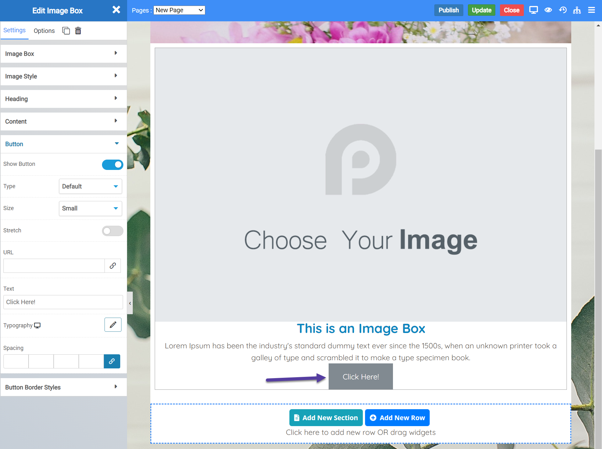
Image Box Widget
The image box widget lets you insert an image with title and caption text beneath it, all contained within a box. A great example of how you could use this would be a photo in memoriam, for example, of a friend, loved one, or beloved pet.
When inserted on to a page, the widget looks like this:
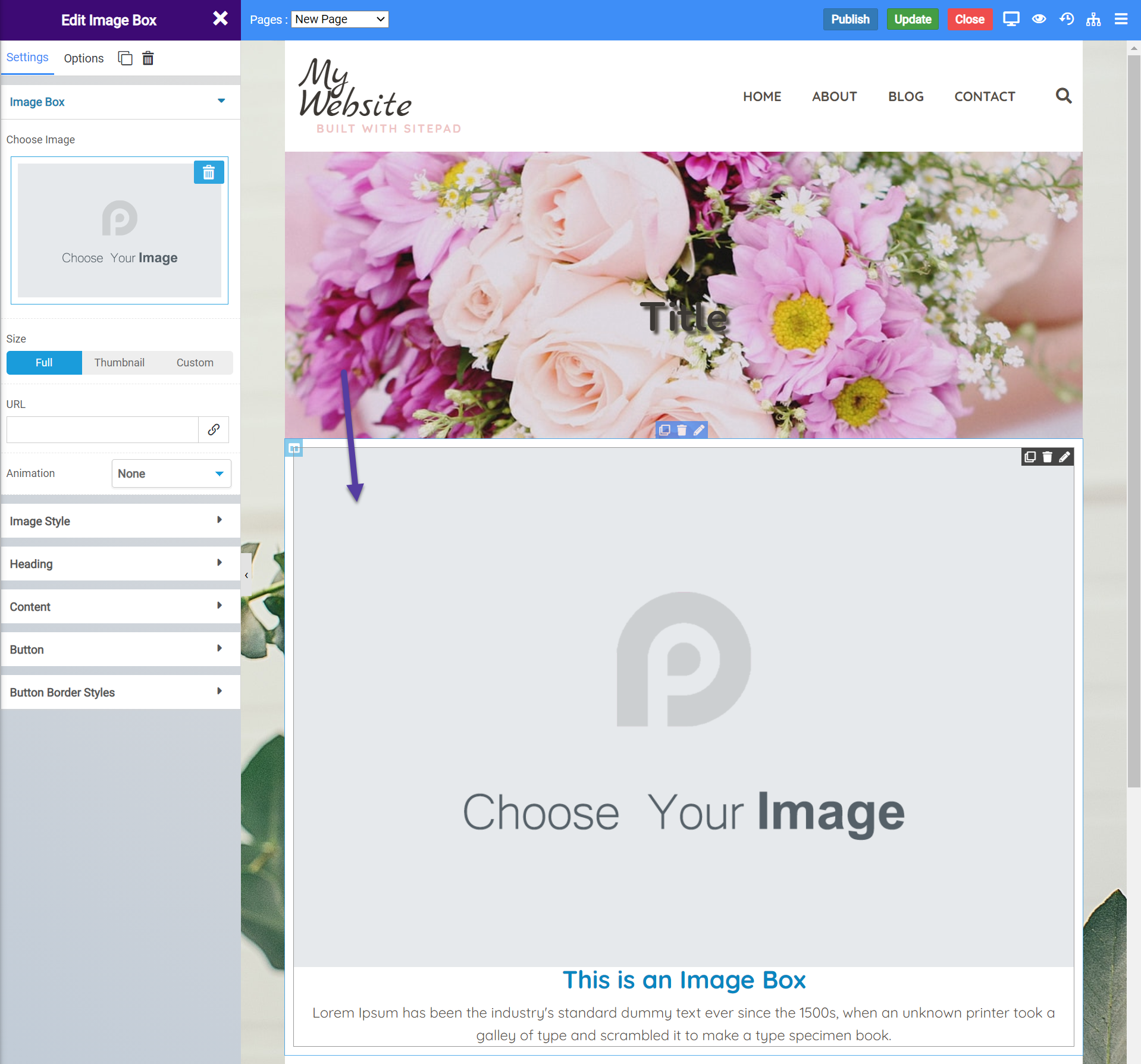
Image Box Widget Settings
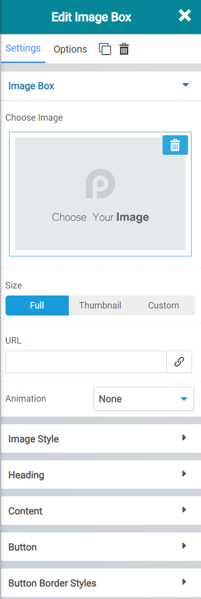
There are many settings for the Image Box widget, let’s review them:
- The Choose Image feature lets you choose a image from your media library to use in the widget.
- You can select the size of the image by selecting full, thumbnail, or custom.
- Using the URL option, you can hyperlink the image to another location on the Internet.
- With Animation, you can put an animation of your choosing on the image, which will certainly draw the eye of your visitors.
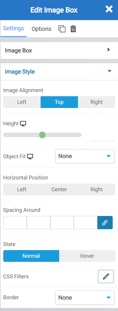
- The Image alignment settings allow you to set an alignment to the image of left, top, or right.
- You can adjust the height of the widget.
- You can choose object fit to give the image you’ve inserted some constraints, just in case it’s too big or too small for the widget itself.
- With Horizontal Positioning, you can adjust the position of the widget.
- The spacing Around allows you to give buffer space to the widget, which depending on your design, can add a nice appeal and focus to the image.
- With State, you can set the image to be as it is, a regular image, or for a border to appear when someone hovers over the image.
- Using CSS Filters you can add in custom code elements.
- Border settings allow you to put a border around the widget, such as a solid, dashed, dotted, etc border.

- The heading setting allows you to control the title text that is inserted beneath the widget.
- You can also create a hyperlink here to another Internet destination.
- With Heading Alignment, you can set the alignment of the heading itself to left, center, or right.
- Using spacing, you can adjust the space between the image box and the heading.
- With State, you can set something to happen when someone hovers over the image.
- The color option allows you to change the color of the text used in the heading.
- Typography allows you to set the font used in the heading.
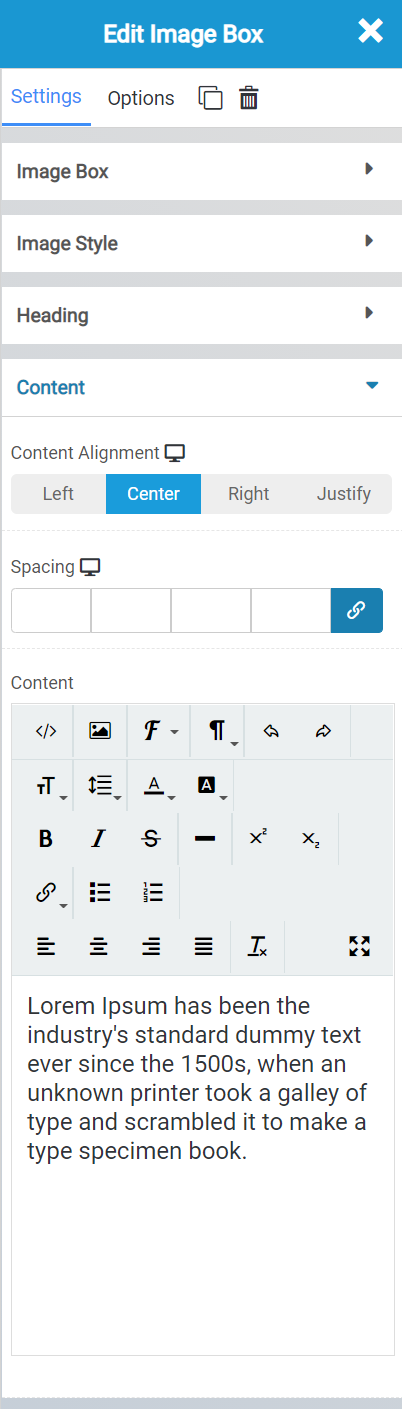
- Content alignment lets you adjust the alignment of the text beneath the Heading.
- Spacing allows you to adjust the space between the content and the heading above.
- The Content box allows you to insert Rich Text to describe the image.
The button settings allow you to insert a button beneath the Image Box which you can style in a number of ways, as well as insert a link to another destination on the Internet. This is an optional feature you can enable/disable as you wish.
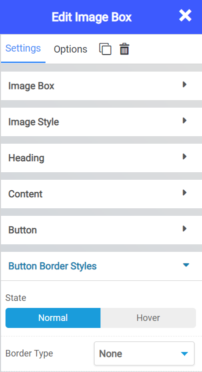
The Button Border Styles option allows you to insert various border styles around the button, when enabled.
Icon Box Widget
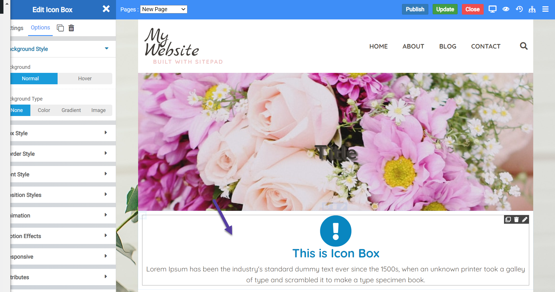
The Icon Box Widget allows you to insert a box with an icon and text onto your web page. When inserted onto a page, the widget looks like this:
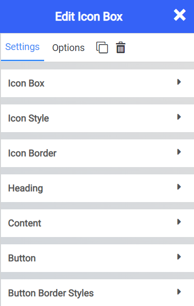
Icon Box Widget Settings
There are many settings for this widget which you should be aware of. Let’s look at the different settings below.
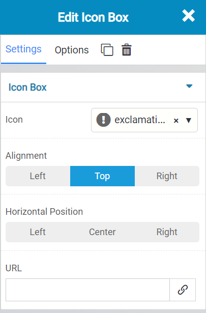
The Icon Box settings allow you to change the following settings:
- The icon that is used in the icon box.
- The alignment of the icon box.
- The horizontal positioning of the box.
- And you can set a Hyperlink for the icon box to another destination on the internet.
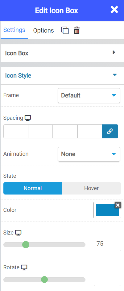 The Icon Style settings allow you to control visual aspects of the Icon, such as:
- The frame around the box.
- The spacing between the box and the icon.
- Whether you want an animation around the box.
- The state of the box, should it remain static when hovered over, or should it do something?
- The color of the icon.
- The size and rotational ratio of the icon.
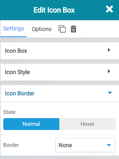 The icon border settings let you choose whether a border should always appear, or only when the user hovers over the box.
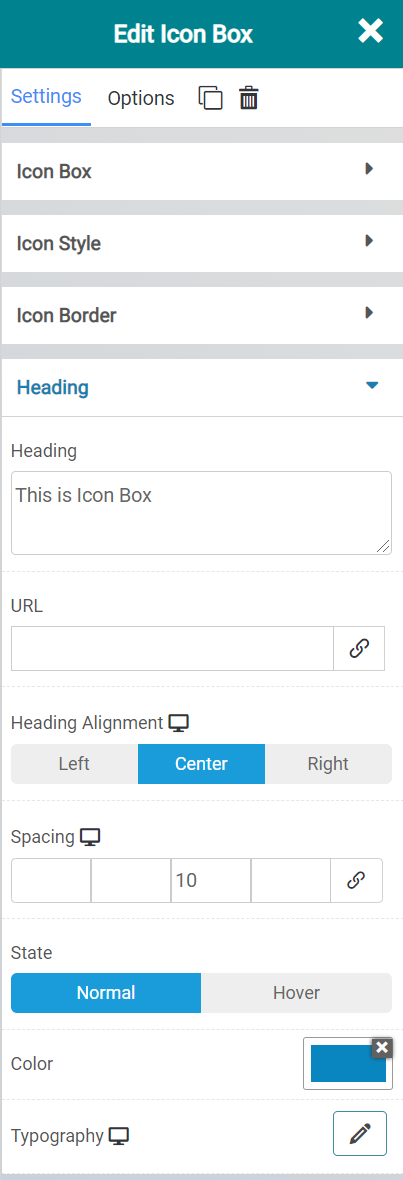
The heading settings allow you to control aspects of the text that goes in the heading of the icon box. This could also be considered the Title Text.
With the URL feature, you can insert a hyperlink here, if you wish.
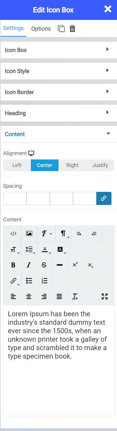
The Content settings enable you to control the text that is inserted beneath the Heading Text. Here you have a rich text editor which you can use to customize and personalize the text inserted here.
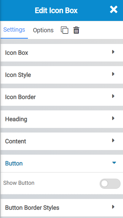
The button settings allow you to insert a button beneath the Image Box which you can style in a number of ways, as well as insert a link to another destination on the Internet. This is an optional feature you can enable/disable as you wish.
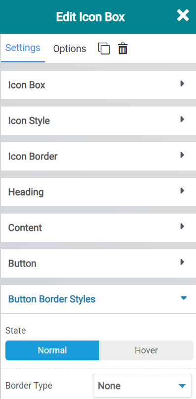
The Button Border Styles settings enable you to choose if you want a border around the button, if enabled, and whether that border should always be present or if it should only show when the user hovers over the button.
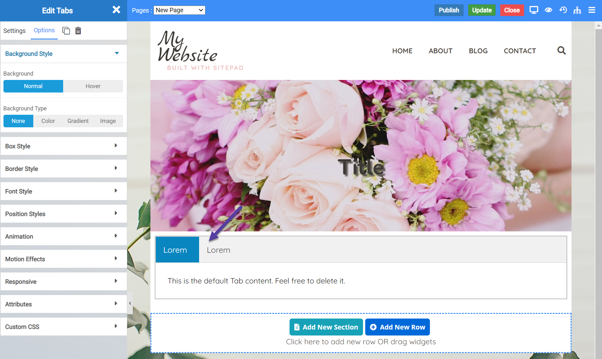
Tab Widget
The tab widget allows you to insert a row of tabs, each of which can display different information.
This can be really useful if you are selling beauty products and there are different versions of the product. You can consolidate them into this widget to save space on your page.
When inserted onto a page, the Tabs Widget looks like this:
Tabs Widget Options
The Tabs Widget has several options you should be aware of, including:
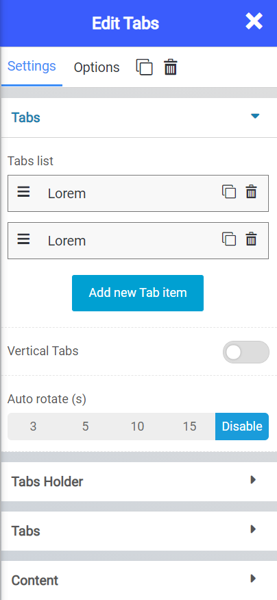
The Tabs setting allows you to adjust the following options:
- The tabs in the list. From here you can add new tab items and arrange them as you wish. You can also copy tabs or delete tabs.
- The vertical tabs button switches the orientation of the tabs from horizontal to vertical.
- The Auto Rotate setting will, when enabled, rotate through all of the tabs and you can adjust the time (in seconds) between rotations if you wish.
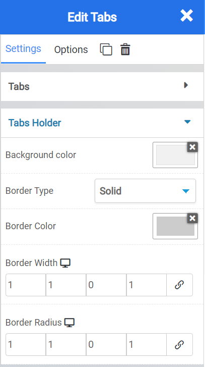
The Tabs Holder setting lets you adjust settings related to the tabs themselves, including:
- The background color used on the tab.
- You can choose from a solid, dotted, dashed, and others, settings for border.
- If you have enabled a border, you can set the color of it.
- With the Width and Radius settings, you can adjust the boundaries of the widget, in pixels.

The Tabs section lets you adjust the following settings:
- With alignment, you can adjust the alignment of the tabs in the widget.
- Using the various color settings, you can change the background color of the tab, the active tab color, and the active tab background color.
- With the Typography setting, you can change the font that is used.
- Using Icon Position setting, you can adjust the position of the tabs from left to right side of the widget.
- With Icon Spacing you can adjust the spacing (in pixels) in between the tabs.
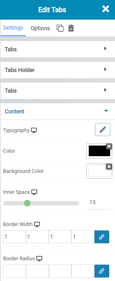
With the Content settings, you can adjust the following options:
- The Typography used in the content of the tabs.
- The color of the font used.
- The background color of the tab.
- The inner space in pixels of the tab where the border of the body section of the tab meets the text.
- The Width and Radius, in pixels, around the content area.
Accordion Widget
The accordion widget is similar to the tabs widget, except it’s vertically oriented and the individual sections expand and contract depending on which section the user is reading.
When inserted onto a page, the widget looks like this:
Accordion Widget Settings
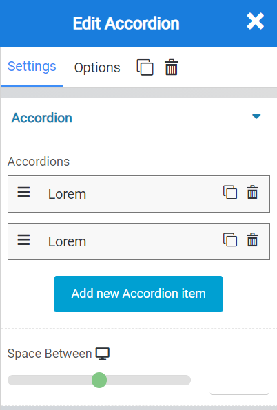
You can adjust the following Accordion settings:
- With the Accordions section, you can add and remove items from the accordions list, as well as copy (duplicate) tabs and delete tabs.
- The Space between setting lets you adjust the space between the accordion items.

The Icon settings let you adjust the following settings:
- The Icon that is used before the accordion tab header text.
- The Active Icon that is used when the accordion tab is expanded.
- The alignment of the accordion items.
- The spacing between them, in pixels.

With the Tabs settings, you can adjust the following:
- The color of the tabs.
- The background color of the tabs.
- The active tab color.
- The background color of the active tab.
- The inner space, in pixels, between the tab and the border of the text.
- and the Font / Typography used in the tab.

Lastly, with the content settings, you can adjust the following:
- The Background color used in the content setting.
- The typography used.
- The padding in pixel or percentages.
- The border type.
- And the border radius.
Collapse Widget
The collapse widget lets you add multiple sections to a website which the user can click to expand or collapse.
When inserted onto a page, the widget looks like this:

Collapse Widget Settings
There are a few settings for this widget which you should know about. Let’s review them!

The Collapse Settings allow you to add in more tab items, and adjust the space between each item. You can use the copy feature to duplicate items on the list to save time.
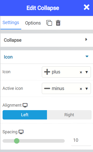
The Icon settings allow you to adjust the Icon that is used to the left of each Collapse section. You can adjust the active and inactive icon, as well as the alignment and spacing between the icon and the heading text.
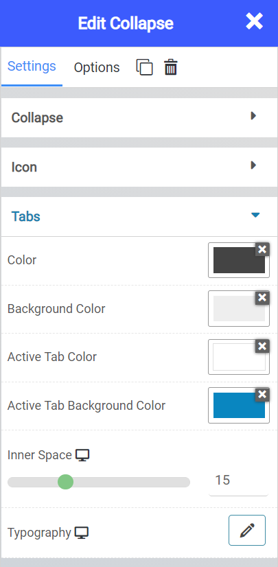
The Tabs section allows you to control all settings related to the tabs, such as their color, spacing and typography.

The Content tab allows you to adjust the appearance of the area containing the widgets you add into the Collapse area when the section is expanded.
Space Widget
The Space Widget lets you insert an area of blank space. When inserted onto a page, the widget looks like this:

Space Widget Settings
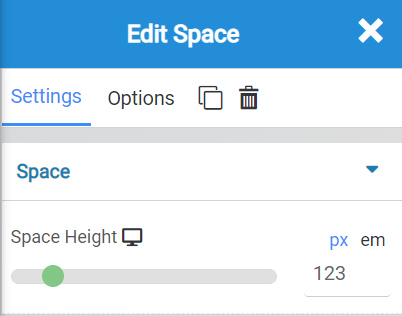
There is one setting for the Space Widget, and that is the height adjustment. You would use this to increase or decrease the blank space the widget provides.
Embed Widget
The embed widget allows you to embed custom HTML onto a page.
When inserted onto your site, the widget looks like this:
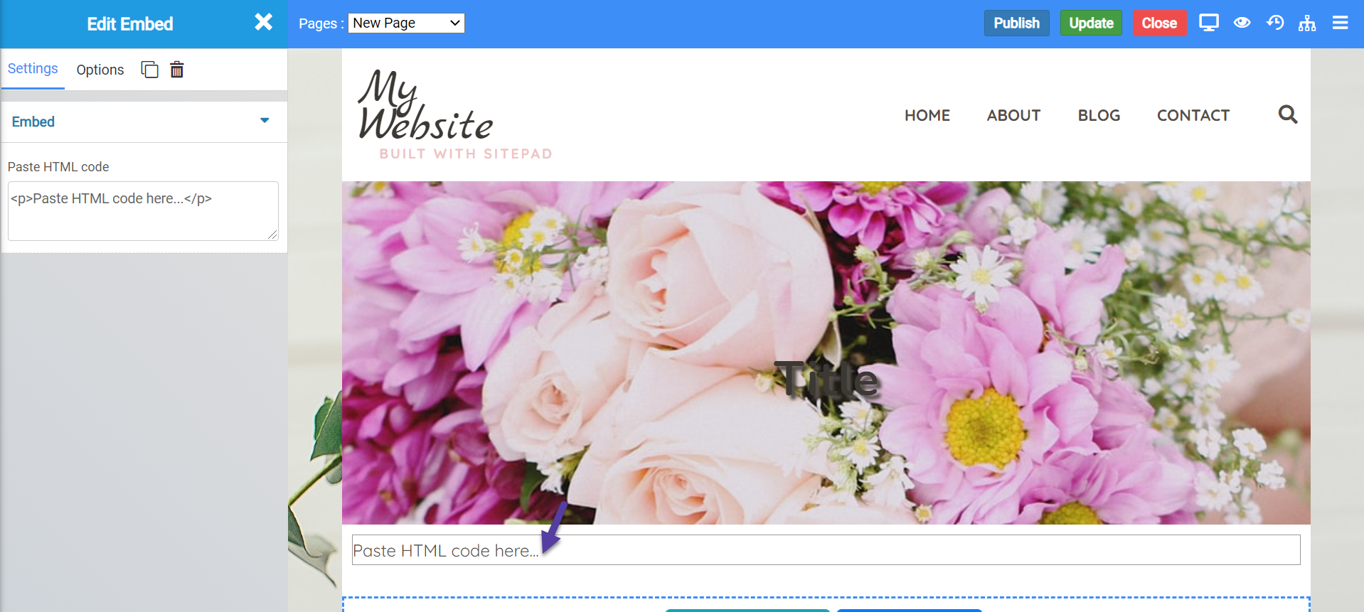
Embed Widget Settings
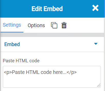
There is only one setting for this widget, Paste HTML Code. This is where you would paste the HTML code you’ve been given for the embed.
Shortcodes Widget
A shortcode is a WordPress-specific code that lets you do many things with very little effortShortcodes can embed files or create objects that would normally require lots of complicated, ugly code in just one line. Shortcode = shortcut.
You can also add shortcodes with the regular text editor widget, but the shortcode widget is much more powerful because you can see how the shortcode looks like without going to preview mode. It is rendered automatically.
You would use shortcodes for things like adding in a contact form, audio widget, or any website API.
When inserted onto a page, the widget looks like this:
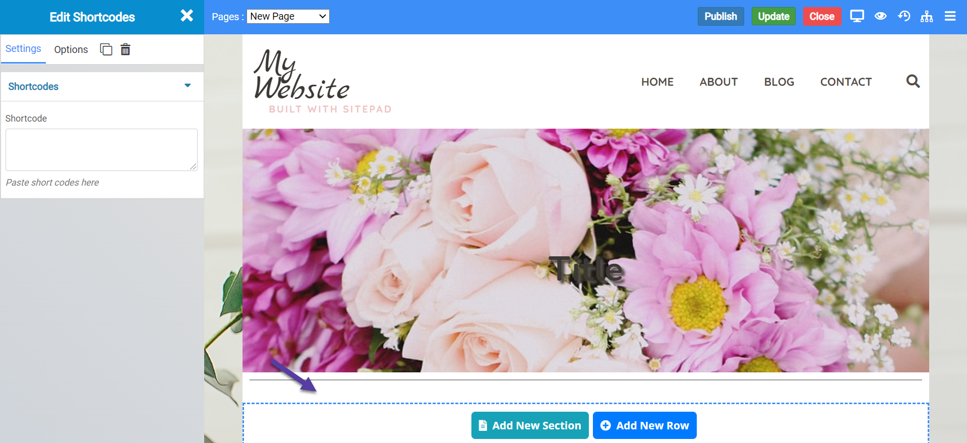
Shortcodes Widget Settings

There is only the one Setting for the Shortcodes Widget, and it’s where you would insert your shortcode.
Google Maps Widget
The Google Maps widget allows you to insert a street-view map of an address you choose.
When inserted onto your web page, the widget looks like this:
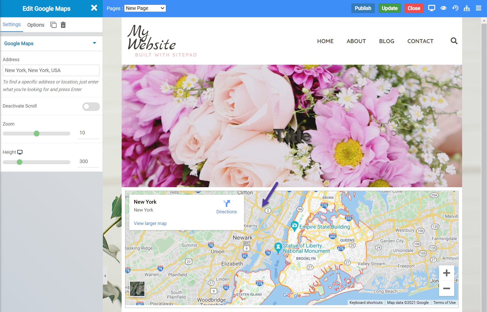
Google Maps Widget Settings

There are a few settings for the Google Maps widget you should know about, including:
- The address to display in the widget.
- You can deactivate the scroll to keep people from scrolling away from your location on the map.
- You can also adjust the zoom level of the map.
- And you can change the height of the widget.
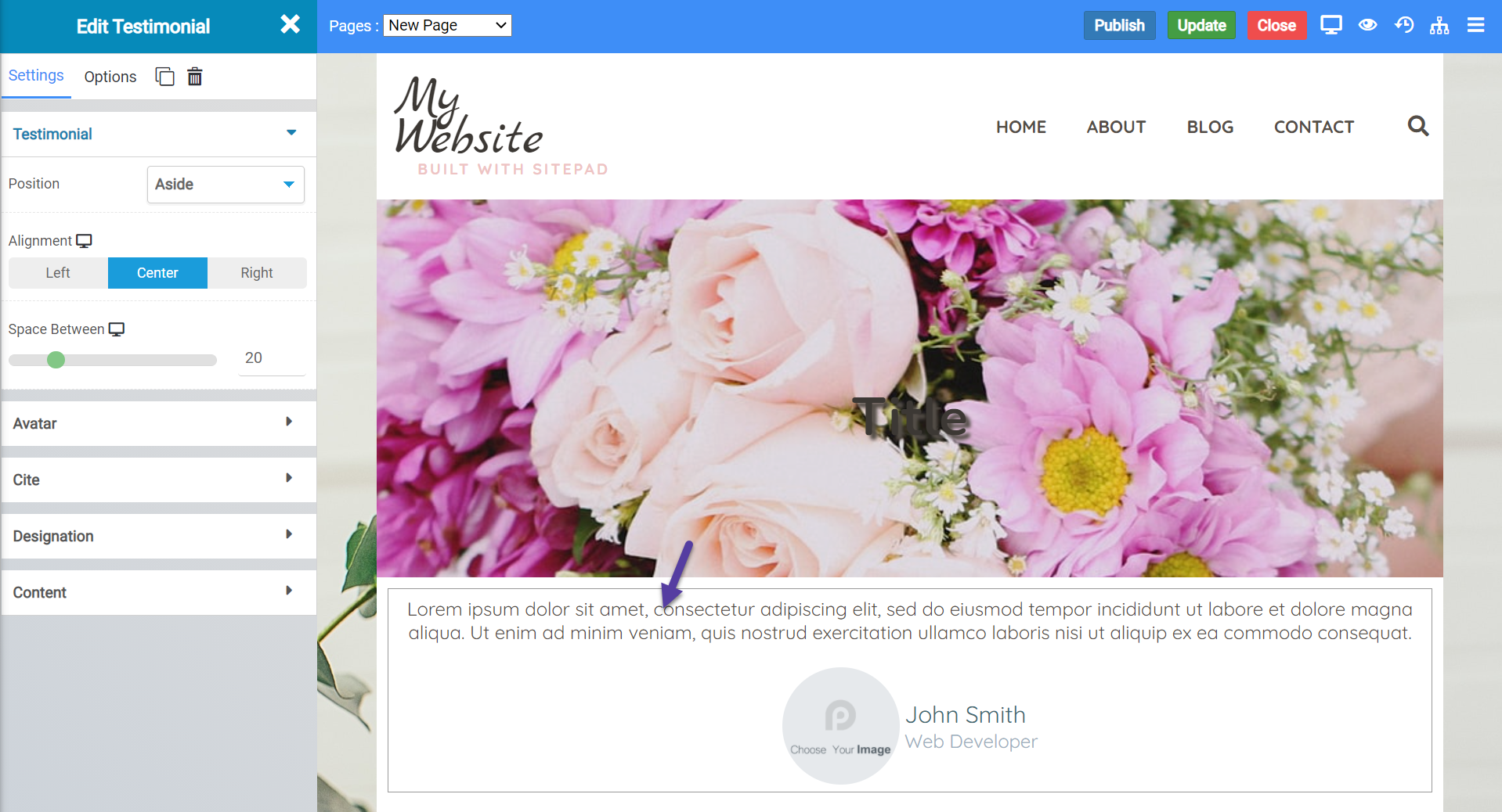
Testimonial Widget
The testimonial widget allows you to add a dedicated space on your website for a customer or user testimonial.
When inserted onto your web page, the widget looks like this:
Testimonial Widget Settings
There are a few settings for this widget you should be aware of, including:
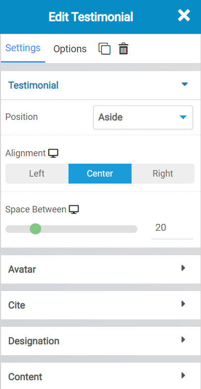 The Testimonial settings allow you to adjust layout settings for the testimonials widget.
- The Position setting allows you to adjust the position of testimonial from name and their photo.
- Using the alignment, you can adjust the alignment of the testimonial.
- With the Space Between setting, you can adjust the space between (in pixels) the testimonial test and the name and photo of the person who contributed the testimonial.

With the Avatar settings, you can control the appearance and layout of the area showing who contributed the testimonial.
- Using the Image setting, you can choose an image from your media library (or upload one) for this testimonial.
- The size setting allows you to adjust the size of the avatar.
- The shape setting allows you to change the shape of the photo.
- And border type allows you to set a border around the avatar area, if you wish.

The Cite settings enable you to adjust layout and appearance settings related to the name of the person who contributed the testimonial.
- The Name setting allows you to adjust the name of the person who contributed the testimonial.
- Using Color, you can set the color of the font used to display their name.
- Typography settings enable you to change the font used.
- If you wish to make the Name a URL Link, you have the option to do that using Link.
- Spacing allows you to adjust, in pixels, the distance between this area of the testimonial widget and the avatar.
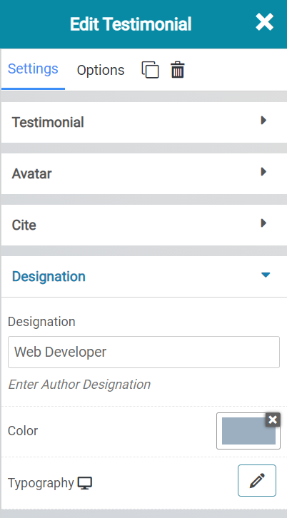
The Designation area allows you to change the title of the person who contributed the testimonial, the color used to display that, and the font used.

Lastly, the Content section of the testimonials widget provides you with a rich text editor to insert the testimonial text.
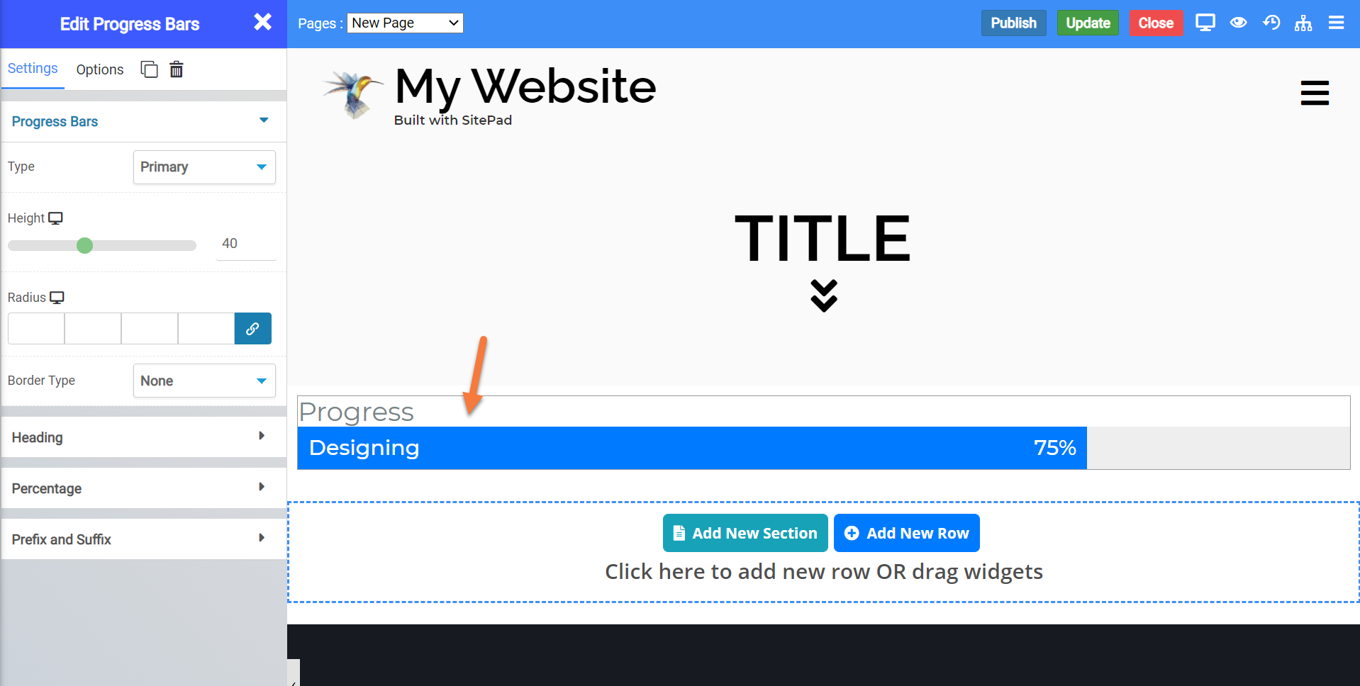
Progress Bars Widget
The Progress Bars widget allows you to add infographic progress bars to your webpage. You can configure these to show as much progress as necessary, along with a title for the “task” or “project name”.
When inserted onto a page, the widget looks like this by default:
Testimonial Widget Settings
There are a few settings for this widget you should be aware of, including:
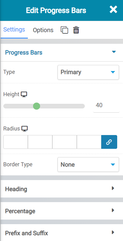 Beneath Progress Bars settings, you have the following options:
- The Type lets you choose the type of Progress Bar you are adding. There are a few settings and each one has it’s own appearance.
- The Height setting lets you control the height of the widget.
- The radius setting lets you control the area around the widget.
- Border Type lets you set a border and the type of border around the widget ,such as a solid, dotted, or dashed widget.
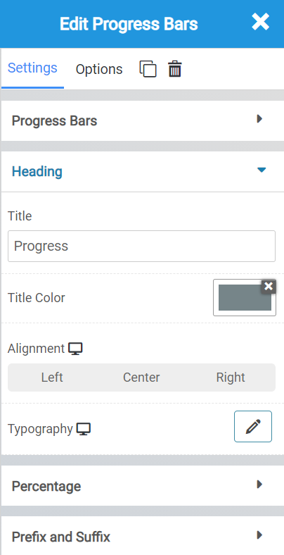
Beneath the Heading setting, you have the following options:
- The Title will allow you to change the Title of the widget.
- Title Color lets you change the color of the title text.
- Alignment allows you to choose from left, center, or right alignment for the title text.
- Typography lets you choose the font used for the title.
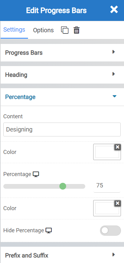
The Percentage settings let you control:
- The title of the content that is shown with the percentage complete.
- The color of the font used.
- The percentage to fill in the widget.
- The color of the percentage fill.
- And the option to hide the percentage number, if you wish.
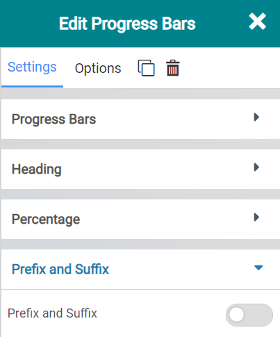
The Prefix and Suffix settings let you insert a visual change to the Widget. When enabled, it looks like this:
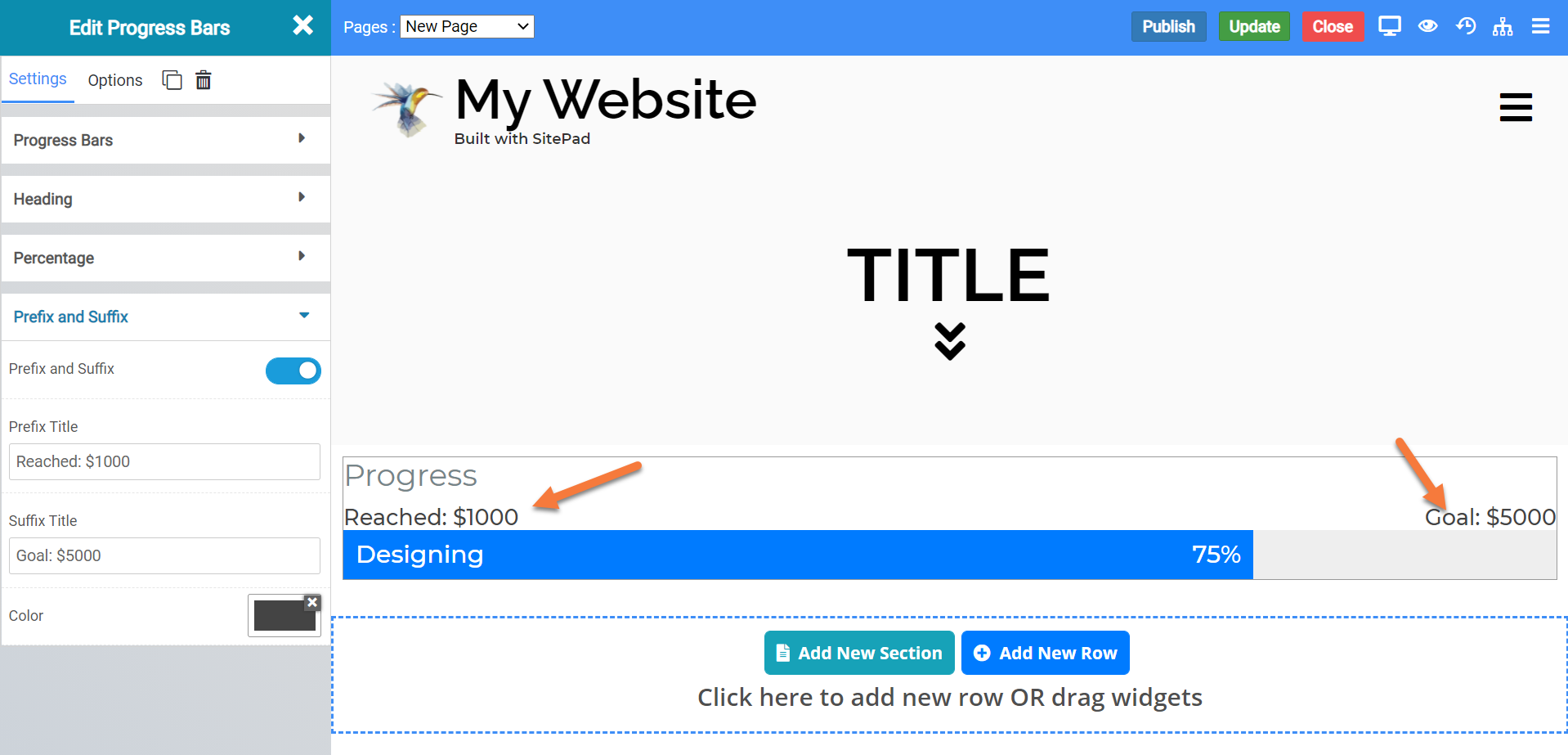
There are also some options that are enabled, as well:
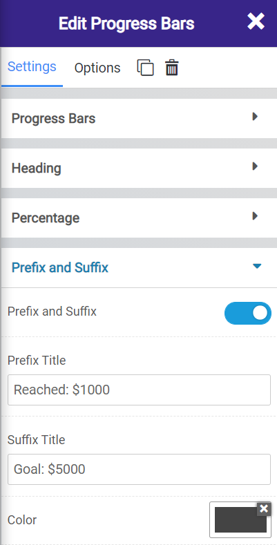
As you can see, you can change the text for the Prefix and Suffix Title to give more detail and illustration to your Progress Bars widget.
Color Block Widget
The Color Block widget lets you insert a block with a specific color onto your webpage. When inserted onto a page, the widget looks like this:
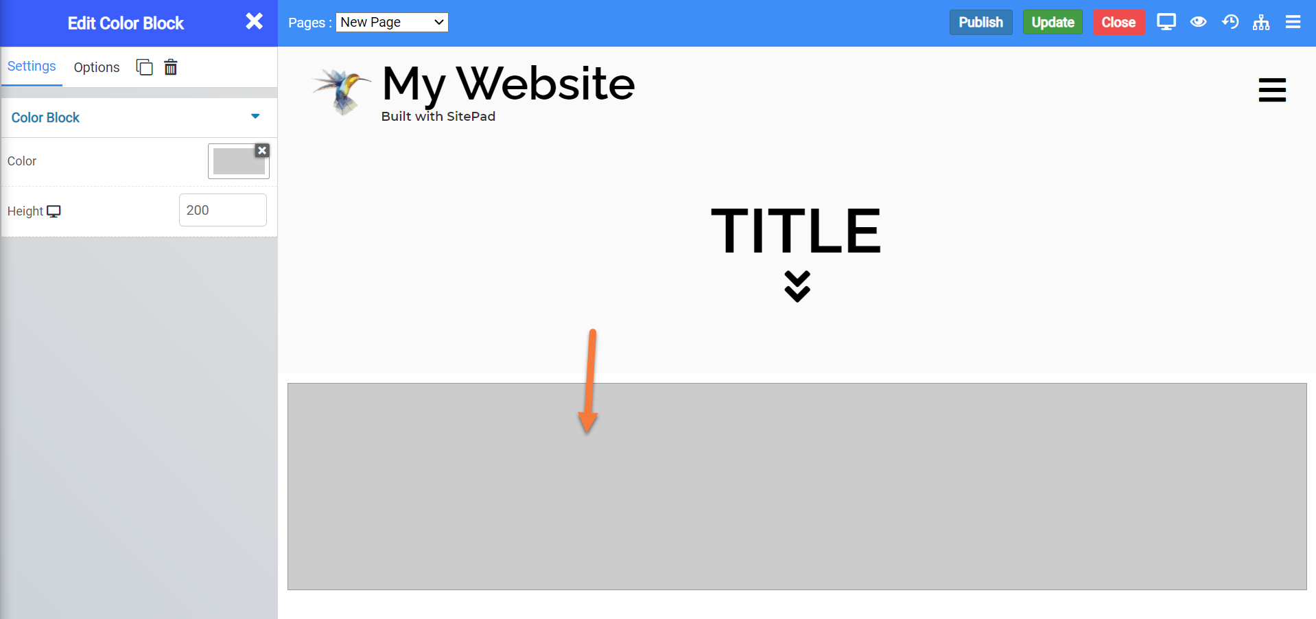
Color Block Widget Settings
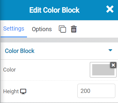
- The Color setting lets you choose the color of the color block.
- The height allows you to adjust, in pixels, the height of the widget.
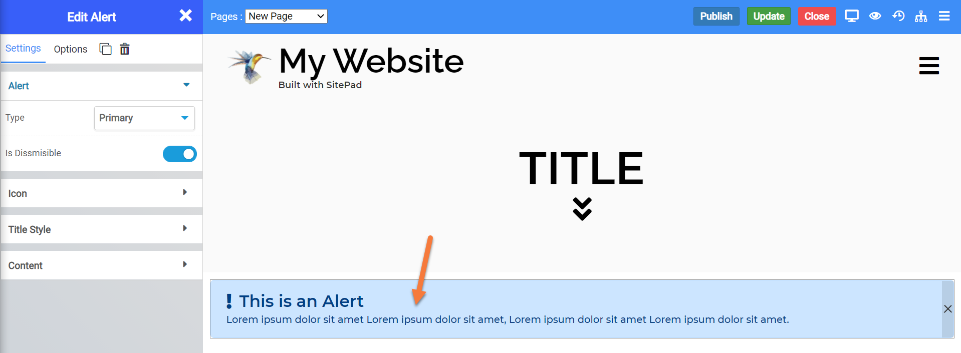
Alert Widget
The Alert Widget lets you insert a widget on your site that features a warning or information info box. When inserted onto your page, the widget looks like this:
Alert Widget Settings
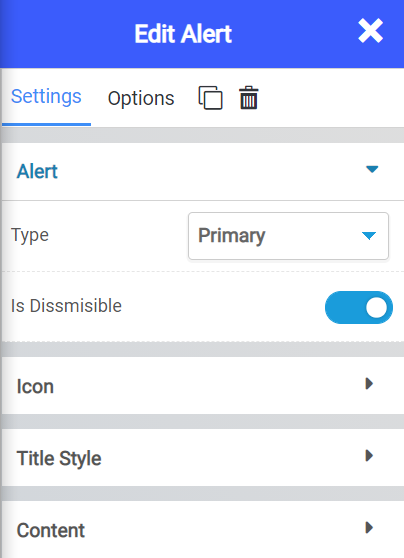
There are a few settings for the Alert Widget you should know about, including:
- The Alert Type lets you choose from a few options what type of alert you wish to display. Each one has it’s own appearance settings, as well.
- You can choose to let customers dismiss the alert by clicking an X in the top right corner.
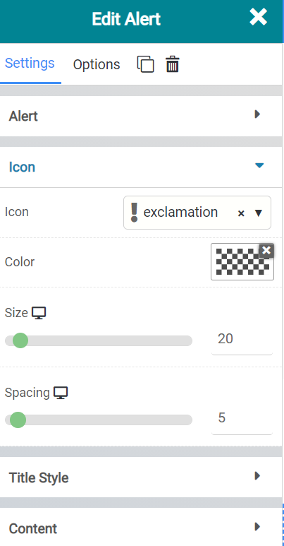
- The Icon setting lets you choose which type of Icon to display on the first line of the widget.
- Color allows you to choose the color of that icon.
- Size allows you to adjust the size, in pixels, of the icon used.
- The Spacing feature lets you adjust the spacing, in pixels, of the icon from the text adjacent to the icon.

- Title lets you adjust the title used in the Alert.
- The color lets you adjust the color of the title text.
- Typography allows you to choose which fonts are used.
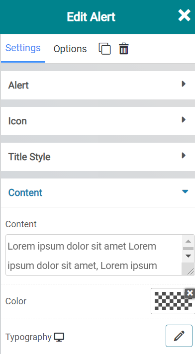
- The Content setting lets you adjust the text that is displayed within the alert.
- The Color settings let you adjust the color of the text used.
- The typography settings let you adjust the font used for the Content text.
Anchor Widget
The Anchor Widget lets you anchor a link to that part of the page using the Unique ID feature.
When inserted onto a page, the widget looks like this:
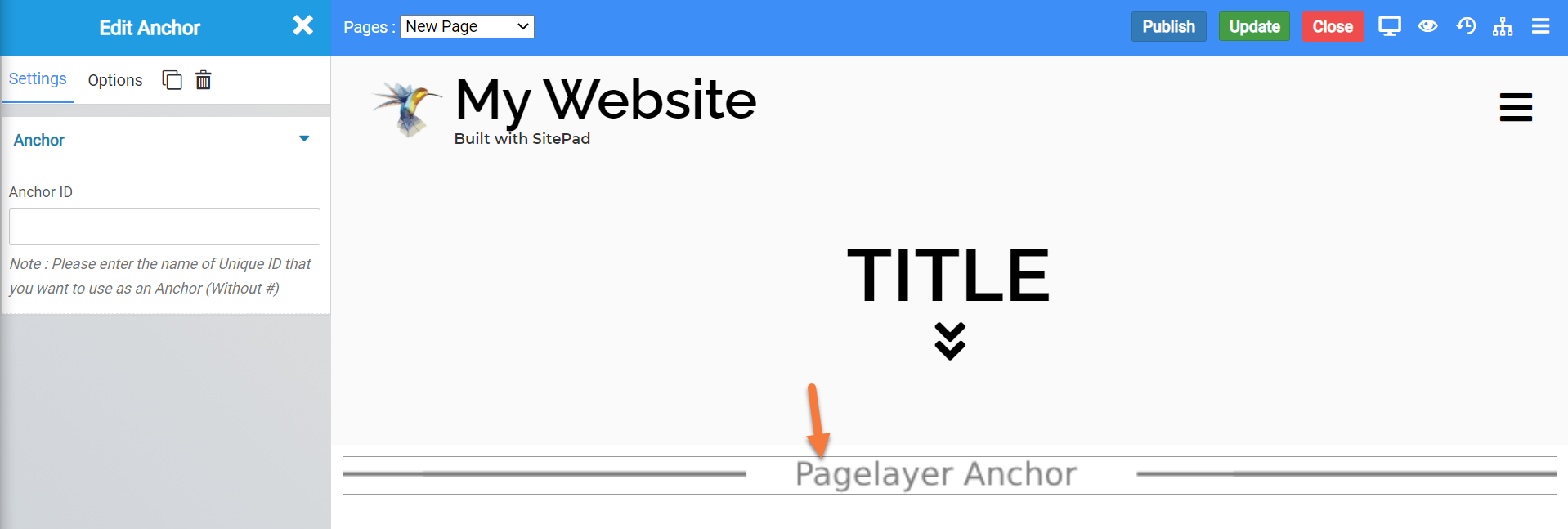
Anchor Widget Settings
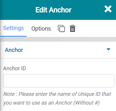
The only setting for this widget is where you will enter the Unique ID (without the #) that you want to use as an Anchor.
Stars Widget
The Stars Widget lets you insert stars, similar to the progress bar widget, which you can configure to use for things like rankings, for example.
When inserted onto a web page, the widget looks like this:
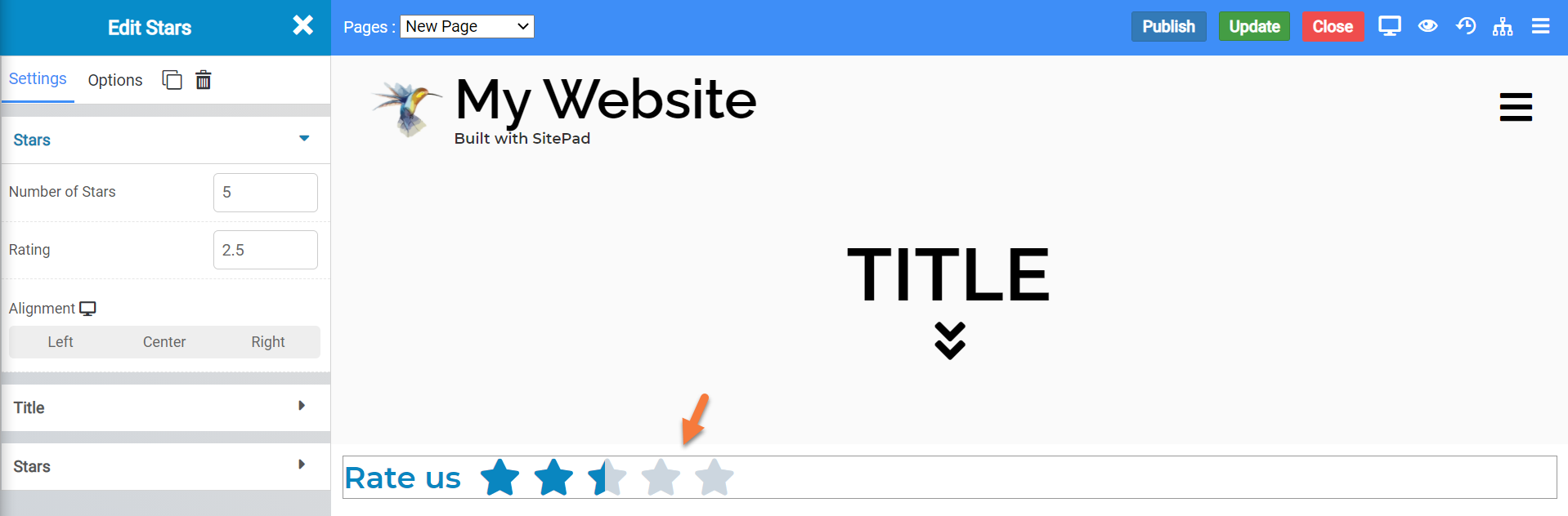
Stars Widget Settings
There are a few settings for this widget which you should be aware of, including:
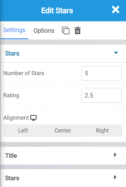
- You can adjust the Number of stars that appear with the first option here.
- The Rating amount will fill the stars up to the rating you have entered.
- Alignment lets you adjust the alignment of the stars.
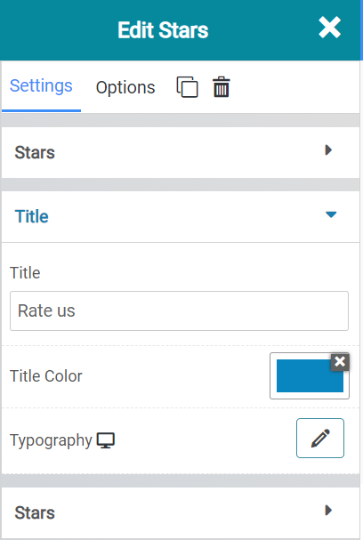
- The Title allows you to adjust the title text of the widget.
- The Title Color allows you to adjust the color of the title text.
- The Typography setting allows you to adjust the font used for hte title.
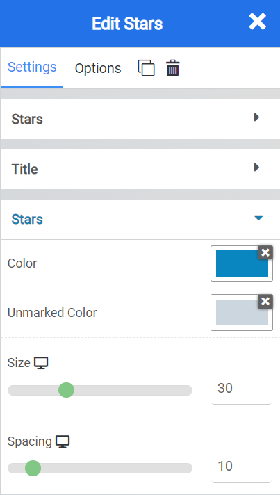
- With the Stars Color setting, you can control the color of the stars where they are filled.
- With Unmarked color, you can control the color of the unfilled portion of the stars.
- The Size option allows you to adjust, in pixels, the size of the stars.
- The Spacing option allows you adjust the Spacing, in pixels, between the individual stars and the adjacent text.
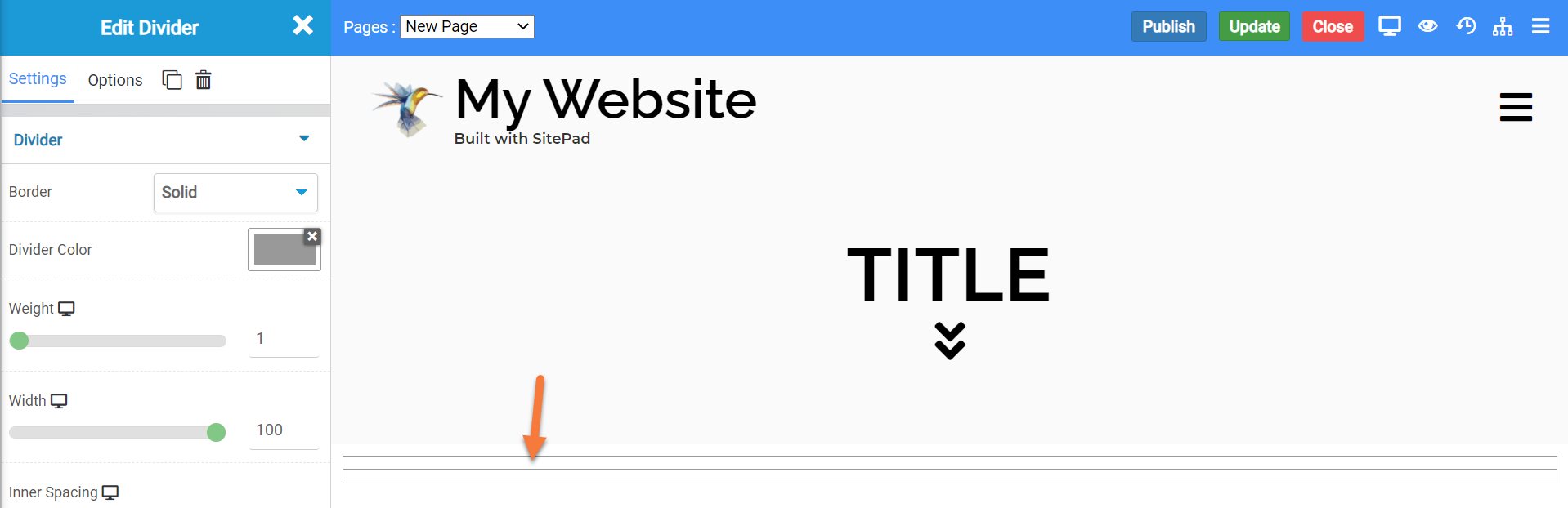
Divider Widget
The divider widget lets you insert a graphical divider on your page. You can use this widget to separate different areas of your page, for example. When inserted onto a page, the widget looks like this:
Divider Widget Settings
There are some settings for this widget which you should be aware of, including:
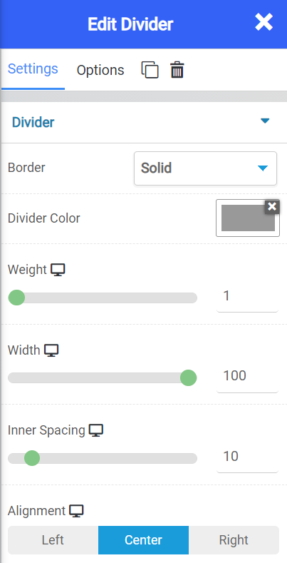
- The Border setting lets you set a solid, dotted, dashed, etc border around the divider widget.
- The color setting lets you adjust the color of the divider
- The weight setting allows you to adjust the thickness of the border, in pixels.
- The width setting lets you adjust how wide on the page the widget is.
- The inner spacing setting lets you adjust the spacing between the 2 rows and the line within the divider widget.
- Lastly, the alignment setting lets you align the widget to left, center, or right. Center is the default.
Counter Widget
The counter widget lets you insert a widget with a number displayed. You can use this for any reason you need, such as the number of customers who have liked a certain item you sell, or anything that requires a count. When the counter loads, it presents as an animation that begins from the starting number and ending number which you set.
When inserted onto a page, the widget looks like this:

Counter Widget Settings
There are a number of settings for this widget you should be aware of, including:
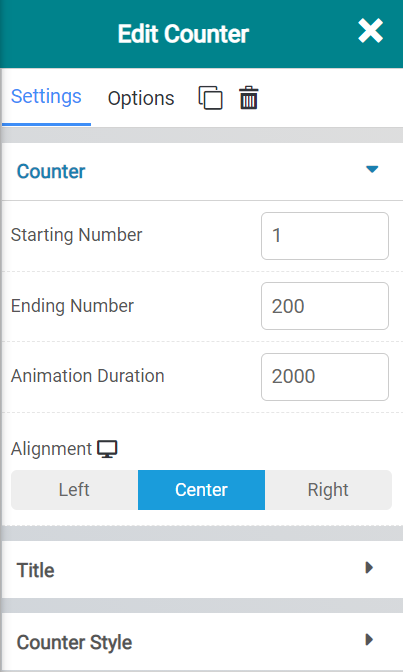
The Counter settings let you adjust the following:
- The starting number is the number which begins the count at the start of the animation.
- The ending number is the number which will be displayed when the end of the count is reached in the animation.
- The Animation Duration setting lets you adjust the time of the animation in milliseconds.
- Alignment allows you to align the counter to left, center, or right. The default is center.

The Title Settings let you adjust the following:
- The title of the counter text.
- The color of the text used.
- And the typography settings let you adjust the font used.
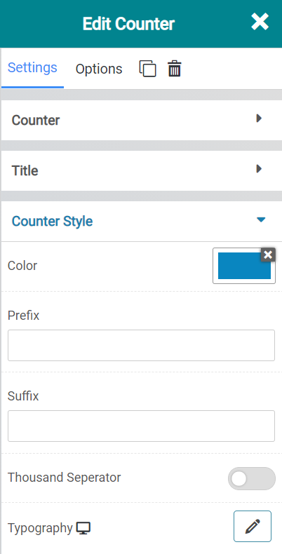
The Counter Style settings allow you to adjust the following:
- With Color you can adjust the color of the numbers in the animation.
- Using the Prefix option, you can
- With Prefix, you can add text to display before the numbers.
- WIth Suffix, you can add text to display after the numbers.
- If you have a large number count, you can separate them out with a comma, which is the Thousand Separator.
- The typography setting lets you adjust the fonts used.
Universal Widget Options
There are many options that are common to all of the widgets, including:
- Background Style
- This is a setting that is specific to the page layout. You can change the whether the background appears as a normal background or if you want the background to change when you hover over it.
- Background Type – This setting allows you to choose from the following settings:
- None – There will not be a background. This means the background of the page will be white, unless otherwise stated in Custom CSS.
- Color – You can specify a custom color for the background.
- Gradient – You can specify a custom gradient. A gradient is a smooth transition between 2 or more colors, which can give a cool effect.
- Image – You can upload a custom image to use as your background.
- Box Style – This setting allows you to adjust the padding and margin for the box that contains your blog post.
- Border Style – This setting allows you to control the following settings:
- Normal – You can have a normal border which is always there.
- Hover – You can have a border that only appears when the area it contains is hovered over.
- Border Type – You can choose from the following border types:
- Solid
- Double
- Dotted
- Dashed
- Grooved
- Border Radius – You can adjust the radius of the border around the box it contains to give it rounder or sharper corners.
- Font Style – This setting allows you to control the following settings:
- Font Family – This setting will allow you to change the font used on the entire page.
- Font Size – This setting allows you to change the size of the text used on the page.
- Font Style – This setting allows you to choose from the following font styles:
- Normal
- Italic
- Oblique
- What is Oblique? Oblique type is a form of a type which slants slightly to the right. It is similar to Italic, but it does not use different glyph (individual letter) shapes.
- Font Weight – This allows you to change the weight of the fonts used on the page.
- Font Variant – If the font you have selected has a variant, you can select it with this setting.
- Typical variants include, Small Caps and Big Caps.
- Animation – With this setting, you can configure number
- Attributes – With this setting, you can apply custom attributes using code.
- Custom CSS – if you want to change certain elements on the page using CSS, you can paste in the code to do that here.