The Website Builder includes over one hundred Widgets for you to use when customizing your website. As they are fully featured and able to do many things, they can be overwhelming to those who first start using them.
A Widget in the Website Builder is something you add to your page that does something, such as display text, an image, a spreadsheet table, or a video, for example.
The Widgets are broken down into groups, such as Grid, Text, Image, Button, Media, and others.
This Knowledgebase Article covers the Button Widgets in the Website Builder.
All About The Media Widgets In The Website Builder
There are three media widgets. They include:
- Video
- Audio
- Video Slider
Let’s explore what each of these widgets do.
Video Widget
The video widget allows you to insert a video on a web page. You insert the video by URL, which means the video will need to be hosted on a site such as YouTube, Vimeo, Dailymotion, etc…
When inserted onto a page, the widget looks like this:
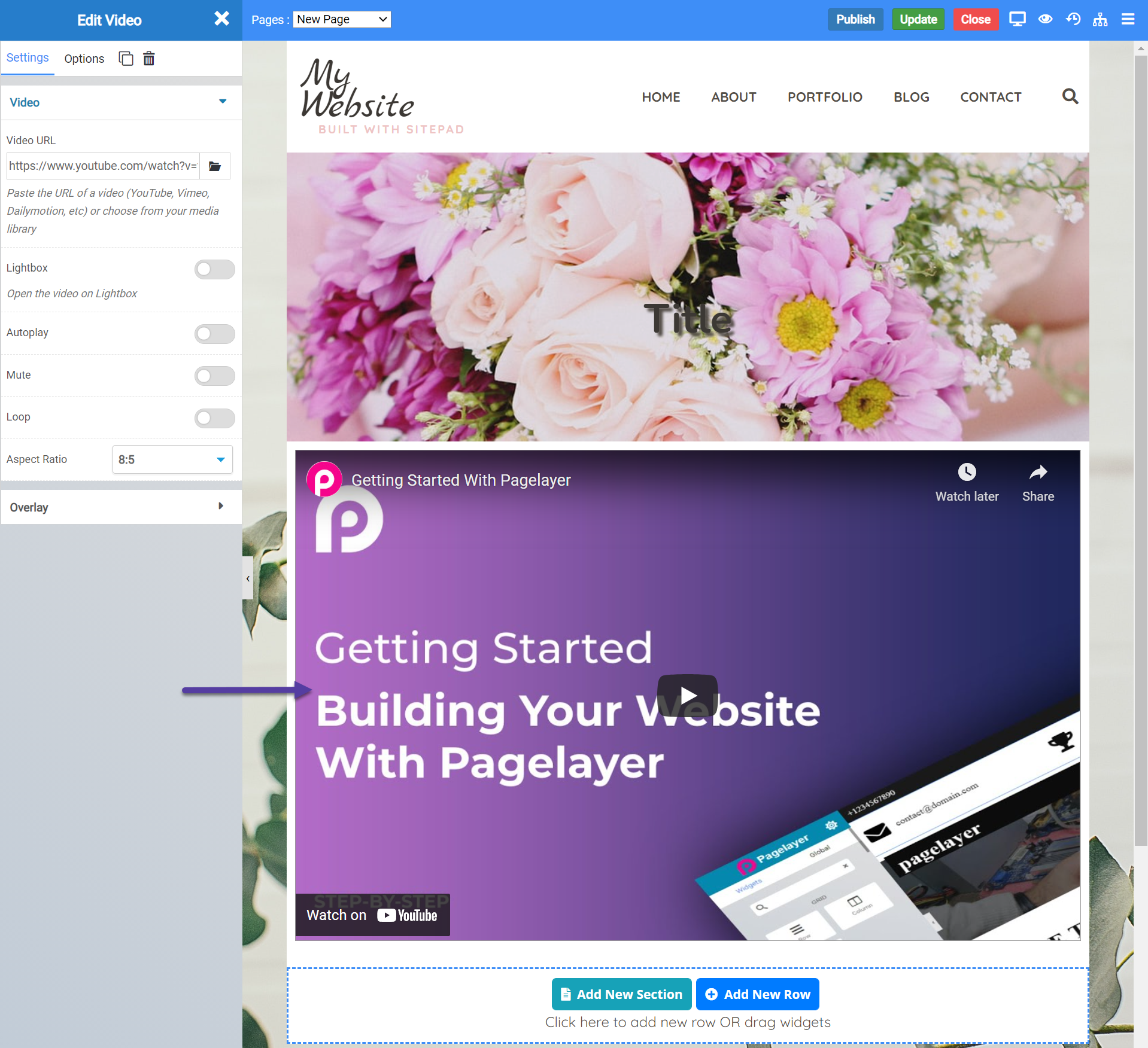
The widget will auto populate itself with the video you see, however you can change it easily.
Video Widget Settings
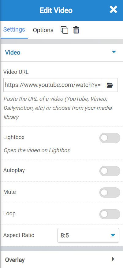
There are a few settings for the video widget you should be aware of, including:
- The option to insert / change the URL of the video you wish to insert on the page.
- Whether you want a lightbox around the video or not.
- Whether the video should auto play when the page loads.
- You have the option to mute the video by default, which will require the user unmute it to hear the audio.
- Loop allows you to play the video over and over, endlessly.
- The aspect ratio setting allows you to change the ratio size of the video widget container, which can be helpful if your videos aspect ratio is different.
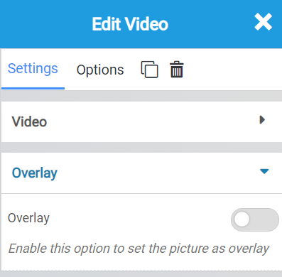
The overlay settings allow you to insert an image that will overlay on the video when the video is stopped.
Video Widget Options
There are many options for the widget, including the following:
- Background Style
- This is a setting that is specific to the page layout. You can change the whether the background appears as a normal background or if you want the background to change when you hover over it.
- Background Type – This setting allows you to choose from the following settings:
- None – There will not be a background. This means the background of the page will be white, unless otherwise stated in Custom CSS.
- Color – You can specify a custom color for the background.
- Gradient – You can specify a custom gradient. A gradient is a smooth transition between 2 or more colors, which can give a cool effect.
- Image – You can upload a custom image to use as your background.
- Box Style – This setting allows you to adjust the padding and margin for the box that contains your blog post.
- Border Style – This setting allows you to control the following settings:
- Normal – You can have a normal border which is always there.
- Hover – You can have a border that only appears when the area it contains is hovered over.
- Border Type – You can choose from the following border types:
- Solid
- Double
- Dotted
- Dashed
- Grooved
- Border Radius – You can adjust the radius of the border around the box it contains to give it rounder or sharper corners.
- Font Style – This setting allows you to control the following settings:
- Font Family – This setting will allow you to change the font used on the entire page.
- Font Size – This setting allows you to change the size of the text used on the page.
- Font Style – This setting allows you to choose from the following font styles:
- Normal
- Italic
- Oblique
- What is Oblique? Oblique type is a form of a type which slants slightly to the right. It is similar to Italic, but it does not use different glyph (individual letter) shapes.
- Font Weight – This allows you to change the weight of the fonts used on the page.
- Font Variant – If the font you have selected has a variant, you can select it with this setting.
- Typical variants include, Small Caps and Big Caps.
- Animation – With this setting, you can configure number
- Attributes – With this setting, you can apply custom attributes using code.
- Custom CSS – if you want to change certain elements on the page using CSS, you can paste in the code to do that here.
Audio Widget
The audio widget allows you to insert audio on your webpage. You would insert the URL to the audio file you want to play, which means you can upload the file to your media library and grab the direct URL to that file, then insert that URL into the link field for this, and that file will be available for playback on the web page.
Keep in mind, this widget relies on the browser supporting HTML5 Audio Playback, which most browsers currently support. If someone is accessing your website on an older browser without HTML5 Audio Playback support, they will see a download icon to download the audio file and play it back offline via their computer.
When inserted onto a page, the audio widget looks like this:
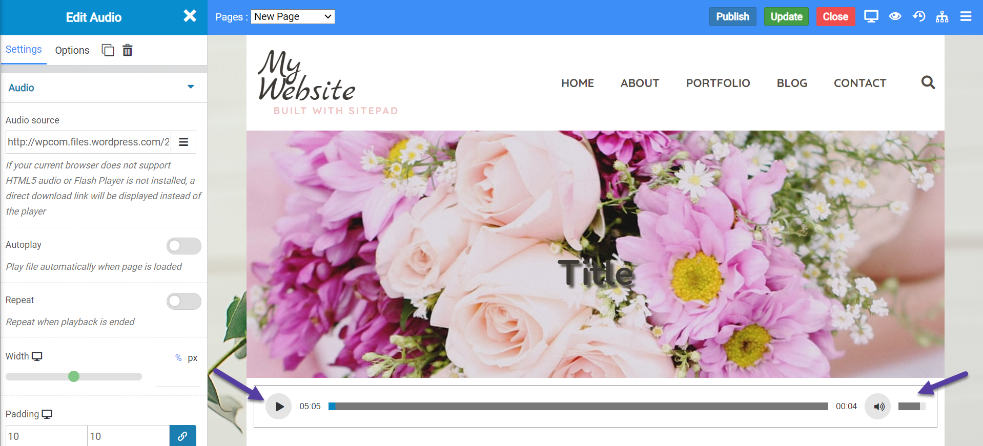
Audio Widget Settings
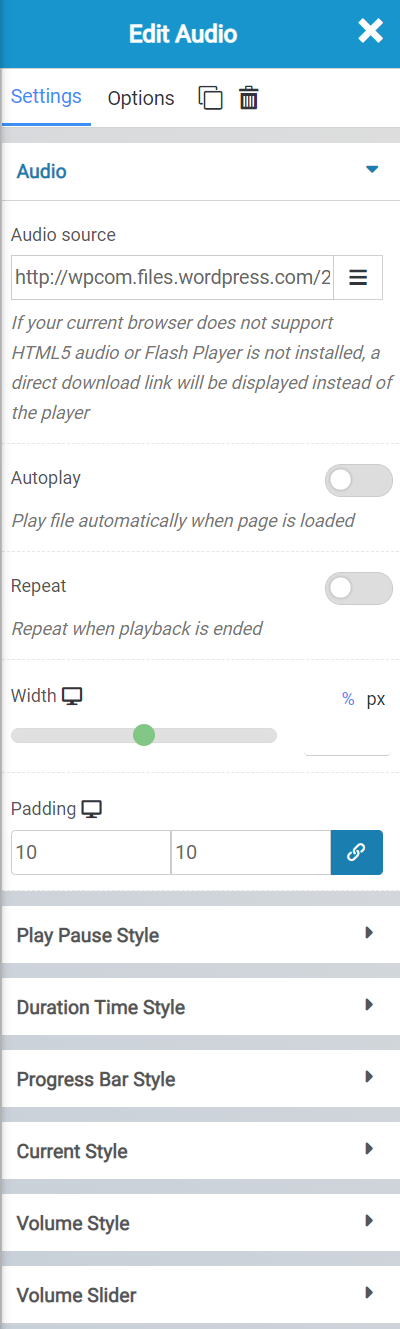
There are a few settings for the audio widget you should be aware of, including the following:
- The Audio Source field is where you will insert the URL to the audio file you’re wanting to playback via this widget.
- The Autoplay feature will determine whether that audio will play when the page loads, or if the user has to click play.
- Repeat will automatically have the audio file repeat once it reaches the end.
- Width allows you to adjust the width of the widget, which can be useful depending on the design aesthetic of your website.
- The padding allows you to adjust the amount of space on each side between the beginning and end of the widget space.
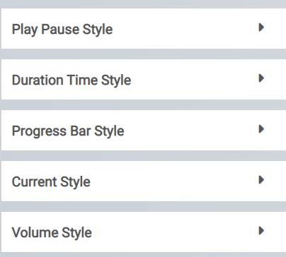
The Style settings allow you to adjust the visual appearance of the buttons, duration, progress bar, and volume control style. You have the option to change everything from their color, to their size.
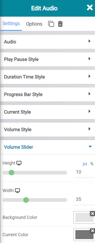
The volume slider settings allow you to adjust the appearance of the volume control that is at the end of the widget.
Audio Widget Options
There are many options for this widget, including:
- Background Style
- This is a setting that is specific to the page layout. You can change the whether the background appears as a normal background or if you want the background to change when you hover over it.
- Background Type – This setting allows you to choose from the following settings:
- None – There will not be a background. This means the background of the page will be white, unless otherwise stated in Custom CSS.
- Color – You can specify a custom color for the background.
- Gradient – You can specify a custom gradient. A gradient is a smooth transition between 2 or more colors, which can give a cool effect.
- Image – You can upload a custom image to use as your background.
- Box Style – This setting allows you to adjust the padding and margin for the box that contains your blog post.
- Border Style – This setting allows you to control the following settings:
- Normal – You can have a normal border which is always there.
- Hover – You can have a border that only appears when the area it contains is hovered over.
- Border Type – You can choose from the following border types:
- Solid
- Double
- Dotted
- Dashed
- Grooved
- Border Radius – You can adjust the radius of the border around the box it contains to give it rounder or sharper corners.
- Font Style – This setting allows you to control the following settings:
- Font Family – This setting will allow you to change the font used on the entire page.
- Font Size – This setting allows you to change the size of the text used on the page.
- Font Style – This setting allows you to choose from the following font styles:
- Normal
- Italic
- Oblique
- What is Oblique? Oblique type is a form of a type which slants slightly to the right. It is similar to Italic, but it does not use different glyph (individual letter) shapes.
- Font Weight – This allows you to change the weight of the fonts used on the page.
- Font Variant – If the font you have selected has a variant, you can select it with this setting.
- Typical variants include, Small Caps and Big Caps.
- Animation – With this setting, you can configure number
- Attributes – With this setting, you can apply custom attributes using code.
- Custom CSS – if you want to change certain elements on the page using CSS, you can paste in the code to do that here.
Video Slider Widget
The video slider widget is similar to the video widget, but it allows you to create a playlist of videos which will play one after the other. A great use case for this is if you are a photographer/videographer and are creating a portfolio site to showcase your footage. This would be a great widget to use to highlight some of your favorite films/short movies.
When inserted onto a page, the video slider widget looks like this:
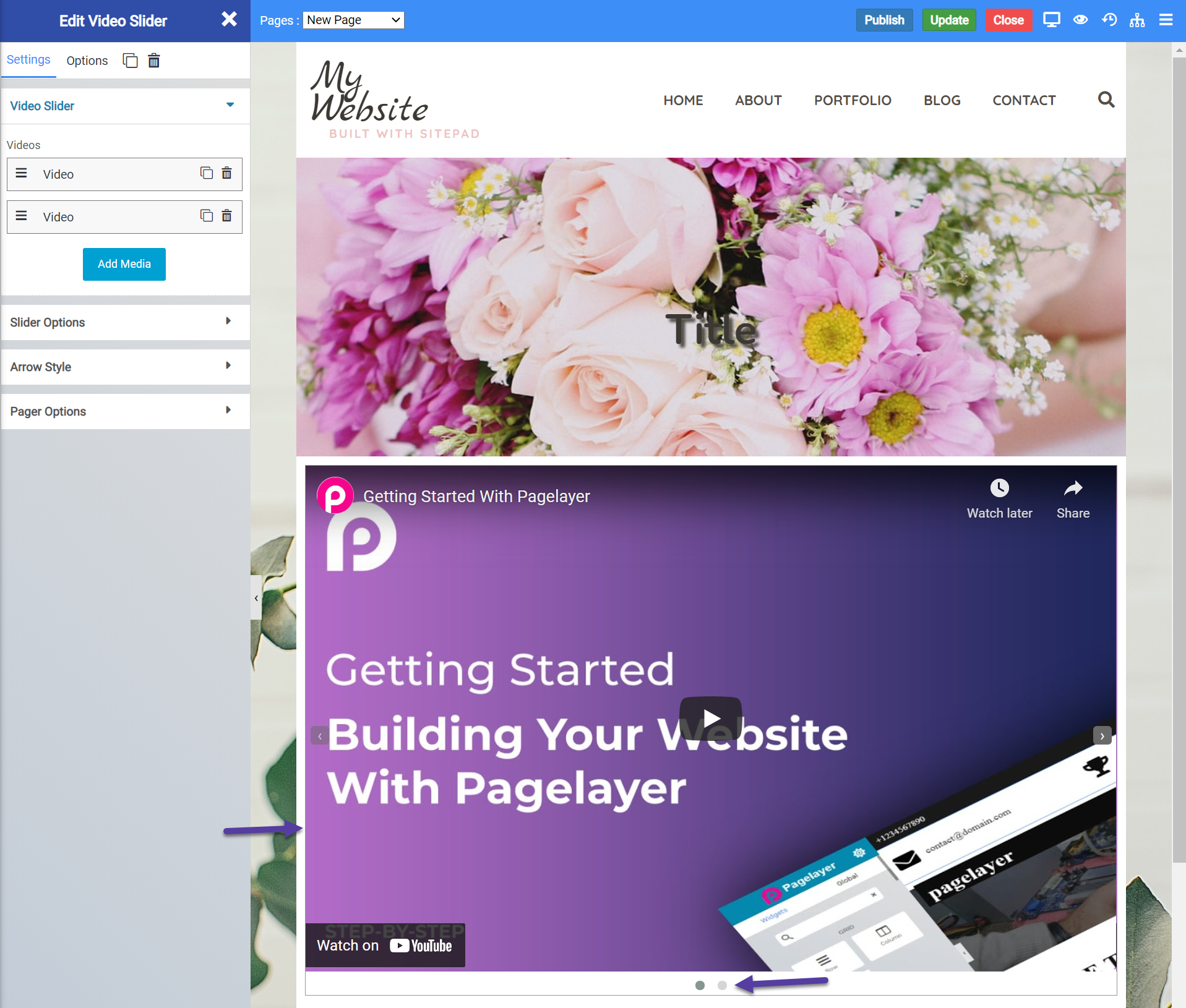
The 2 dots beneath the widget indicate there are 2 videos in the playlist for this video slider widget. Clicking the 2nd dot will show the 2nd video.
Video Slider Widget Settings
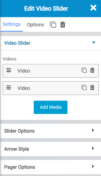
There are many settings for the video slider widget you should be aware of, including:
- The “Add Media” option lets you add in different videos for your playlist. You can add them in by inserting a URL to the video, which means the video must be hosted on a platform such as YouTube or Vimeo. You can also insert the direct URL to a video you’ve uploaded to your Media Library here.
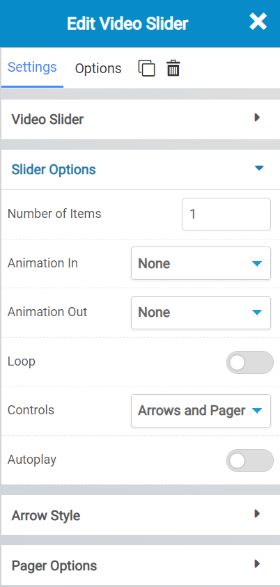
The Slider Options allow you to control the following:
- The number of items in the slider.
- The animation used in or out when the video loads or exits.
- Whether the videos should loop.
- Whether you want the controls to display.
- Whether the video should auto play.
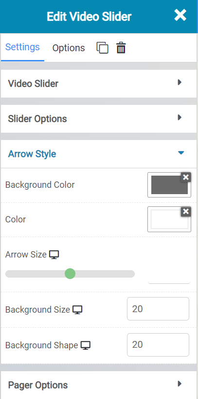
The Arrow Style settings allows you to control the following:
- The Background color of the arrow container.
- The color of the arrow.
- The size of the arrow.
- And the size and shape of the background container.
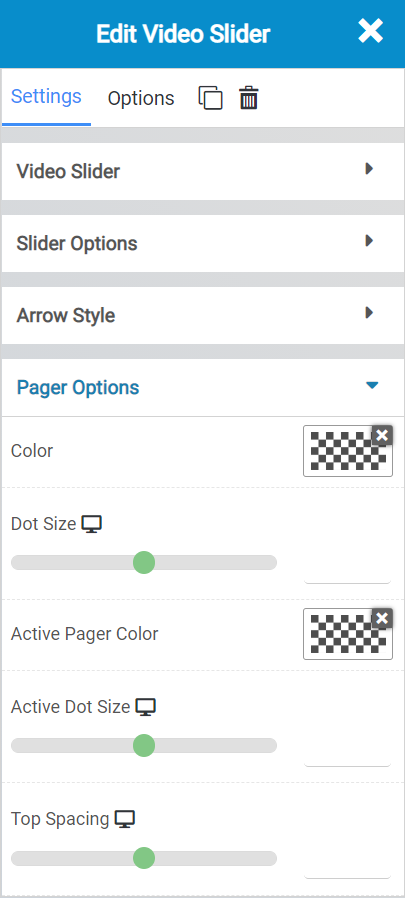
The Pager Options allow you to control the following settings:
- The color of the pager, which is the dots at the bottom of the slider widget.
- The size of them.
- The color of the active and inactive, as well as the space and size of the dots.
Video Slider Options
There are many options for this widget, including:
- Background Style
- This is a setting that is specific to the page layout. You can change the whether the background appears as a normal background or if you want the background to change when you hover over it.
- Background Type – This setting allows you to choose from the following settings:
- None – There will not be a background. This means the background of the page will be white, unless otherwise stated in Custom CSS.
- Color – You can specify a custom color for the background.
- Gradient – You can specify a custom gradient. A gradient is a smooth transition between 2 or more colors, which can give a cool effect.
- Image – You can upload a custom image to use as your background.
- Box Style – This setting allows you to adjust the padding and margin for the box that contains your blog post.
- Border Style – This setting allows you to control the following settings:
- Normal – You can have a normal border which is always there.
- Hover – You can have a border that only appears when the area it contains is hovered over.
- Border Type – You can choose from the following border types:
- Solid
- Double
- Dotted
- Dashed
- Grooved
- Border Radius – You can adjust the radius of the border around the box it contains to give it rounder or sharper corners.
- Font Style – This setting allows you to control the following settings:
- Font Family – This setting will allow you to change the font used on the entire page.
- Font Size – This setting allows you to change the size of the text used on the page.
- Font Style – This setting allows you to choose from the following font styles:
- Normal
- Italic
- Oblique
- What is Oblique? Oblique type is a form of a type which slants slightly to the right. It is similar to Italic, but it does not use different glyph (individual letter) shapes.
- Font Weight – This allows you to change the weight of the fonts used on the page.
- Font Variant – If the font you have selected has a variant, you can select it with this setting.
- Typical variants include, Small Caps and Big Caps.
- Animation – With this setting, you can configure number
- Attributes – With this setting, you can apply custom attributes using code.
- Custom CSS – if you want to change certain elements on the page using CSS, you can paste in the code to do that here.