The Website Builder includes over one hundred Widgets for you to use when customizing your website. As they are fully featured and able to do many things, they can be overwhelming to those who first start using them.
A Widget in the Website Builder is something you add to your page that does something, such as display text, an image, a spreadsheet table, or a video, for example.
The Widgets are broken down into groups, such as Grid, Text, Image, Button, Media, and others.
This Knowledgebase Article covers the Button Widgets in the Website Builder.
All About The Button Widgets In The Website Builder
There are 5 button widgets. They are as follows:
- Button
- Social Profile
- Button Group
- Social Share
- Download Button
Let’s explore what each of these widgets do.
Button Widget
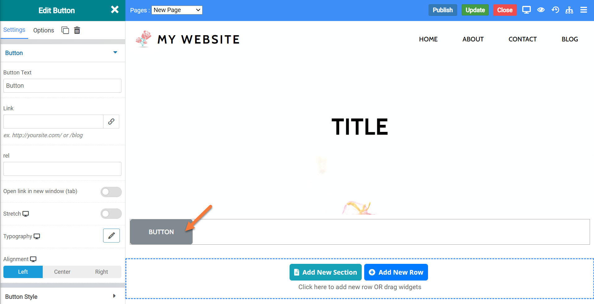
The button widget allows you to insert a simple button onto your website. You can use this button for just about anything you want.
When inserted into a page, the button widget looks like this:
Button Widget Settings
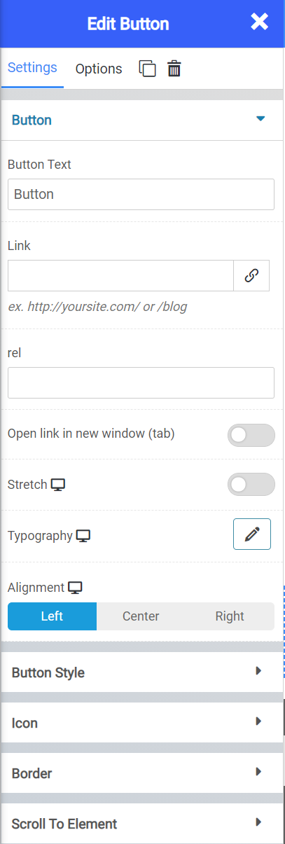
The button widget has a lot of different settings for you to personalize the widget. Let’s review the settings:
- The Button Text option lets you control what text is displayed within the button.
- With the Link option, you can set the button to be a link to another destination on the internet.
- Using Stretch, you can have the buttons span the page.
- With Typography, you can change the font that is used in the button.
- With the Alignment settings, you can set the button to be aligned to the left, center, or right of your webpage.
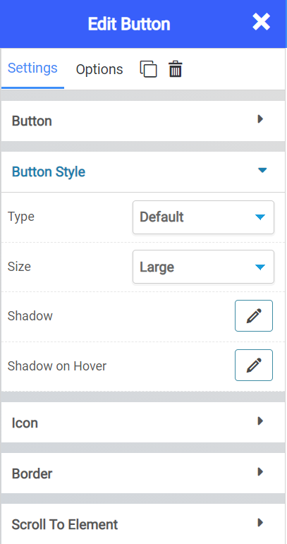
- The Button Style Type lets you control what kind of button is inserted. You can choose from different styles of buttons.
- Control the size of your button with the Size option.
- With Shadow or Shadow on Hover, you can change the shadow option for the button, whether you want it there all the time or only when a visitor to your site hovers over the button.
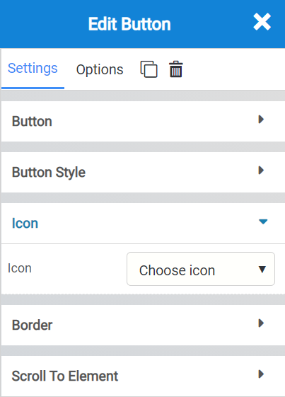
The icon option allows you to insert an icon into the Button. You can choose from hundreds of different icons.
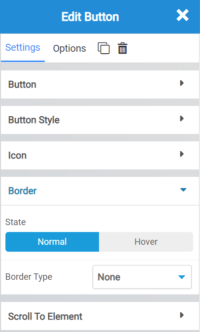
- The border options let you set one that is static (i.e. on all the time) or only on when a visitor to your site hovers over it.
- With Border Type, you can choose from a different border, such as solid, dashed, dotted, etc.
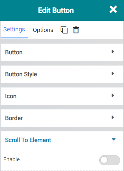
Scroll to element enables you to set this button to jump to content further down the same page. This can be helpful if you are using this button in a FAQ-style page.
Button Widget Options
There are many options you should know about, including:
- Background Style
- This is a setting that is specific to the page layout. You can change the whether the background appears as a normal background or if you want the background to change when you hover over it.
- Background Type – This setting allows you to choose from the following settings:
- None – There will not be a background. This means the background of the page will be white, unless otherwise stated in Custom CSS.
- Color – You can specify a custom color for the background.
- Gradient – You can specify a custom gradient. A gradient is a smooth transition between 2 or more colors, which can give a cool effect.
- Image – You can upload a custom image to use as your background.
- Box Style – This setting allows you to adjust the padding and margin for the box that contains your blog post.
- Border Style – This setting allows you to control the following settings:
- Normal – You can have a normal border which is always there.
- Hover – You can have a border that only appears when the area it contains is hovered over.
- Border Type – You can choose from the following border types:
- Solid
- Double
- Dotted
- Dashed
- Grooved
- Border Radius – You can adjust the radius of the border around the box it contains to give it rounder or sharper corners.
- Font Style – This setting allows you to control the following settings:
- Font Family – This setting will allow you to change the font used on the entire page.
- Font Size – This setting allows you to change the size of the text used on the page.
- Font Style – This setting allows you to choose from the following font styles:
- Normal
- Italic
- Oblique
- What is Oblique? Oblique type is a form of a type which slants slightly to the right. It is similar to Italic, but it does not use different glyph (individual letter) shapes.
- Font Weight – This allows you to change the weight of the fonts used on the page.
- Font Variant – If the font you have selected has a variant, you can select it with this setting.
- Typical variants include, Small Caps and Big Caps.
- Animation – With this setting, you can configure number
- Attributes – With this setting, you can apply custom attributes using code.
- Custom CSS – if you want to change certain elements on the page using CSS, you can paste in the code to do that here.
Social Profile Widget
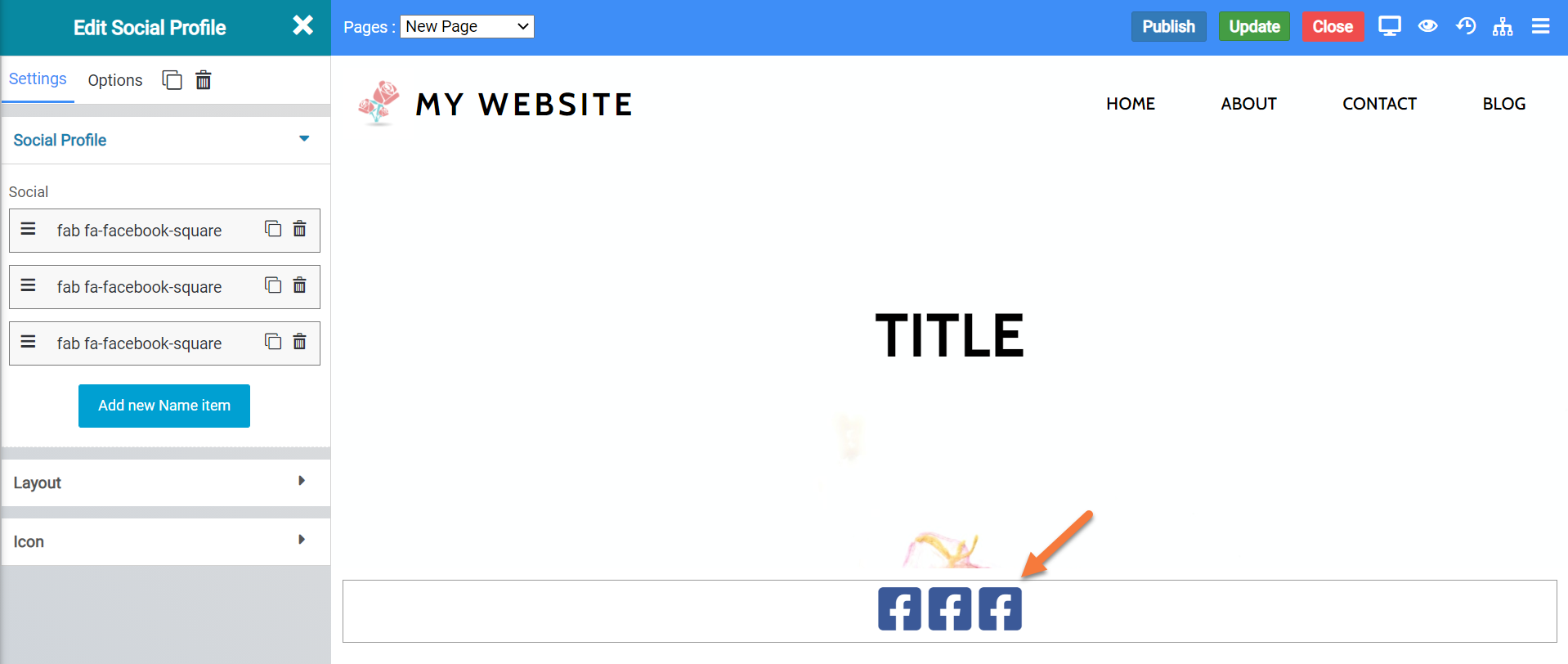
The Social Profile Widget allows you to insert links to your social media profiles.
When inserted onto a page, it looks like this:
Social Profile Widget Settings
There are a few settings which go along with this widget which you should be familiar with, including:
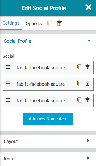
- The Social Section lets you add/remove different social networks. By default, three Facebooks are added, but you can remove them and add others, such as Twitter, Instagram, and LinkedIn.
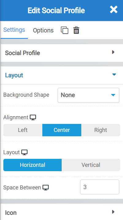
- The Background Shape option lets you choose whether you want a background shape behind the Social Media platform icon.
- You can align the social icon widget to the left, center, or right, with the Alignment setting.
- With Layout, you can set the buttons to be laid out in a horizontal or vertical line.
- The Space Between option lets you choose how many pixels are in between each social media platform icon.
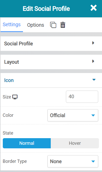
With the Icon settings, you can choose:
- The size of the social media icons.
- The colors of them.
- Whether you want a “state” applied to them, such a one that’s always on, or one that only activates when the user hovers over the icon.
- And you can choose from the border type, such as solid, dotted, dashed, none, etc.
Social Profile Widget Options
There are a lot of different options for this widget, including:
- Background Style
- This is a setting that is specific to the page layout. You can change the whether the background appears as a normal background or if you want the background to change when you hover over it.
- Background Type – This setting allows you to choose from the following settings:
- None – There will not be a background. This means the background of the page will be white, unless otherwise stated in Custom CSS.
- Color – You can specify a custom color for the background.
- Gradient – You can specify a custom gradient. A gradient is a smooth transition between 2 or more colors, which can give a cool effect.
- Image – You can upload a custom image to use as your background.
- Box Style – This setting allows you to adjust the padding and margin for the box that contains your blog post.
- Border Style – This setting allows you to control the following settings:
- Normal – You can have a normal border which is always there.
- Hover – You can have a border that only appears when the area it contains is hovered over.
- Border Type – You can choose from the following border types:
- Solid
- Double
- Dotted
- Dashed
- Grooved
- Border Radius – You can adjust the radius of the border around the box it contains to give it rounder or sharper corners.
- Font Style – This setting allows you to control the following settings:
- Font Family – This setting will allow you to change the font used on the entire page.
- Font Size – This setting allows you to change the size of the text used on the page.
- Font Style – This setting allows you to choose from the following font styles:
- Normal
- Italic
- Oblique
- What is Oblique? Oblique type is a form of a type which slants slightly to the right. It is similar to Italic, but it does not use different glyph (individual letter) shapes.
- Font Weight – This allows you to change the weight of the fonts used on the page.
- Font Variant – If the font you have selected has a variant, you can select it with this setting.
- Typical variants include, Small Caps and Big Caps.
- Animation – With this setting, you can configure number
- Attributes – With this setting, you can apply custom attributes using code.
- Custom CSS – if you want to change certain elements on the page using CSS, you can paste in the code to do that here.
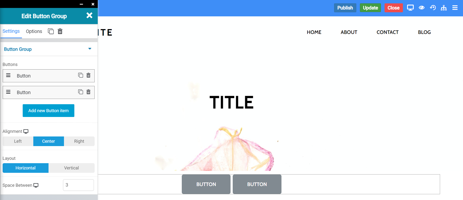
Button Group Widget
The button group widget allows you to insert groups of buttons, each of which can have their own function.
When inserted onto a page, it looks like this:
Button Widget Settings
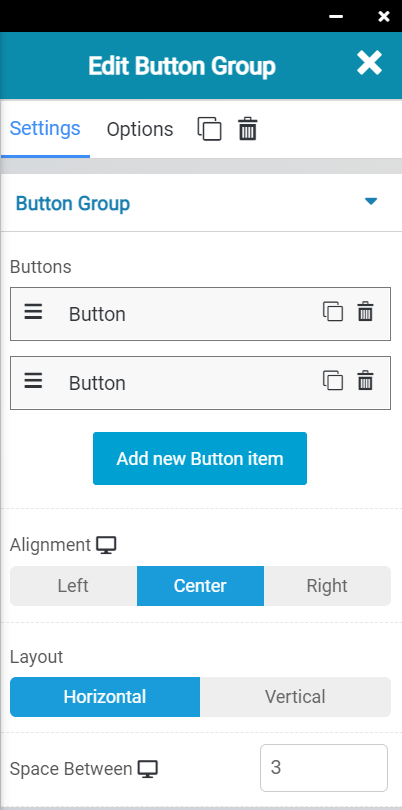
The button widget has several settings you should be aware of, including:
- The ability to add and remove buttons. You can also rename them to suit your purpose for adding them.
- You can set the alignment of the buttons from left, center, and right.
- You can also change the layout of the buttons from a horizontal layout, or vertical layout.
- You can also adjust the space between the buttons in pixels, if you wish.
Button Widget Settings
There are many button widget settings you should be aware of, including:
- Background Style
- This is a setting that is specific to the page layout. You can change the whether the background appears as a normal background or if you want the background to change when you hover over it.
- Background Type – This setting allows you to choose from the following settings:
- None – There will not be a background. This means the background of the page will be white, unless otherwise stated in Custom CSS.
- Color – You can specify a custom color for the background.
- Gradient – You can specify a custom gradient. A gradient is a smooth transition between 2 or more colors, which can give a cool effect.
- Image – You can upload a custom image to use as your background.
- Box Style – This setting allows you to adjust the padding and margin for the box that contains your blog post.
- Border Style – This setting allows you to control the following settings:
- Normal – You can have a normal border which is always there.
- Hover – You can have a border that only appears when the area it contains is hovered over.
- Border Type – You can choose from the following border types:
- Solid
- Double
- Dotted
- Dashed
- Grooved
- Border Radius – You can adjust the radius of the border around the box it contains to give it rounder or sharper corners.
- Font Style – This setting allows you to control the following settings:
- Font Family – This setting will allow you to change the font used on the entire page.
- Font Size – This setting allows you to change the size of the text used on the page.
- Font Style – This setting allows you to choose from the following font styles:
- Normal
- Italic
- Oblique
- What is Oblique? Oblique type is a form of a type which slants slightly to the right. It is similar to Italic, but it does not use different glyph (individual letter) shapes.
- Font Weight – This allows you to change the weight of the fonts used on the page.
- Font Variant – If the font you have selected has a variant, you can select it with this setting.
- Typical variants include, Small Caps and Big Caps.
- Animation – With this setting, you can configure number
- Attributes – With this setting, you can apply custom attributes using code.
- Custom CSS – if you want to change certain elements on the page using CSS, you can paste in the code to do that here.
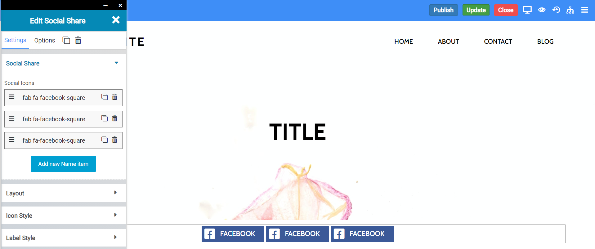
Social Share Widget
The social share widget lets you create buttons that allows visitors to your website to share your content in their social media feeds.
When inserted onto a page, it looks like this:
Social Share Widget Settings
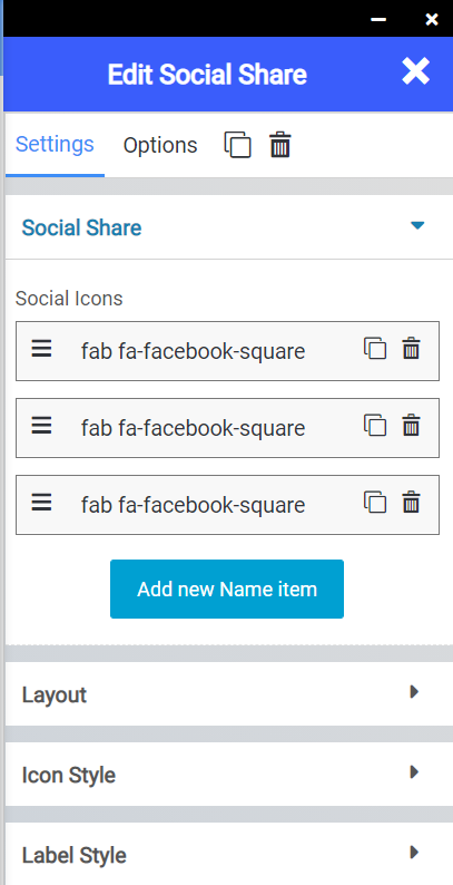
There are several settings you should know about, including:
- The option to add more buttons.
- The option to arrange the buttons how you wish.
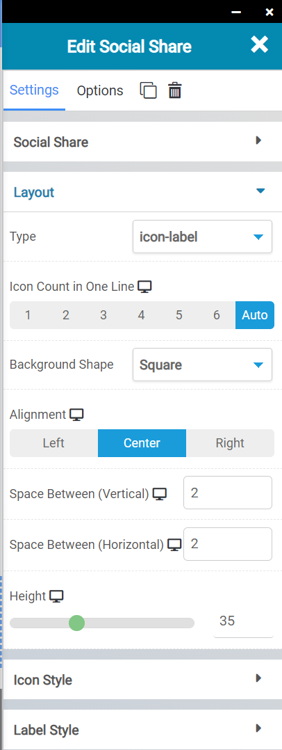
- You can choose your Icon-Client Areael, i.e. which will show the social media icon + the network name, just the name, or just their logo.
- You can show how many icons you want on a single line.
- You can change the background shape, as well as the alignment.
- You can also change the space between (vertical) and space between (horizontal) of the icons.
- The height of the social media row is also adjustable.
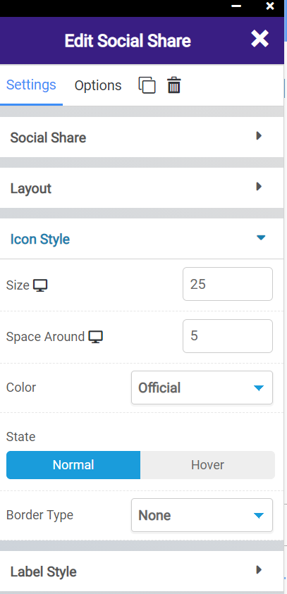
The icon style settings allow you to adjust the following:
- The size of the icons.
- The space around the icons.
- The color theme of the icons.
- Their state, if they are static, or if something should happen to them when a visitor hovers over them.
- And you can set the border type, solid, dotted, dashed, etc.
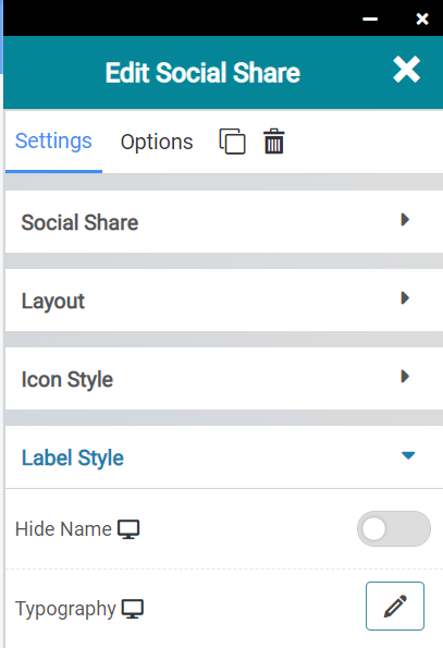
The label style settings let you control the following:
- If you want the social network name to show on the button.
- And which fonts are used.
Social Share Widget Options
There are many options you should be aware of:
- Background Style
- This is a setting that is specific to the page layout. You can change the whether the background appears as a normal background or if you want the background to change when you hover over it.
- Background Type – This setting allows you to choose from the following settings:
- None – There will not be a background. This means the background of the page will be white, unless otherwise stated in Custom CSS.
- Color – You can specify a custom color for the background.
- Gradient – You can specify a custom gradient. A gradient is a smooth transition between 2 or more colors, which can give a cool effect.
- Image – You can upload a custom image to use as your background.
- Box Style – This setting allows you to adjust the padding and margin for the box that contains your blog post.
- Border Style – This setting allows you to control the following settings:
- Normal – You can have a normal border which is always there.
- Hover – You can have a border that only appears when the area it contains is hovered over.
- Border Type – You can choose from the following border types:
- Solid
- Double
- Dotted
- Dashed
- Grooved
- Border Radius – You can adjust the radius of the border around the box it contains to give it rounder or sharper corners.
- Font Style – This setting allows you to control the following settings:
- Font Family – This setting will allow you to change the font used on the entire page.
- Font Size – This setting allows you to change the size of the text used on the page.
- Font Style – This setting allows you to choose from the following font styles:
- Normal
- Italic
- Oblique
- What is Oblique? Oblique type is a form of a type which slants slightly to the right. It is similar to Italic, but it does not use different glyph (individual letter) shapes.
- Font Weight – This allows you to change the weight of the fonts used on the page.
- Font Variant – If the font you have selected has a variant, you can select it with this setting.
- Typical variants include, Small Caps and Big Caps.
- Animation – With this setting, you can configure number
- Attributes – With this setting, you can apply custom attributes using code.
- Custom CSS – if you want to change certain elements on the page using CSS, you can paste in the code to do that here.
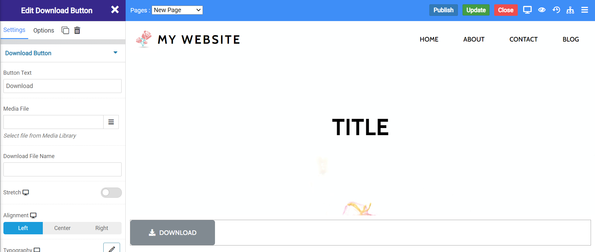
Download Button Widget
The download button widget lets you insert a download button so your visitors can download files from your website.
When inserted onto a page, the widget looks like this:
Download Widget Settings
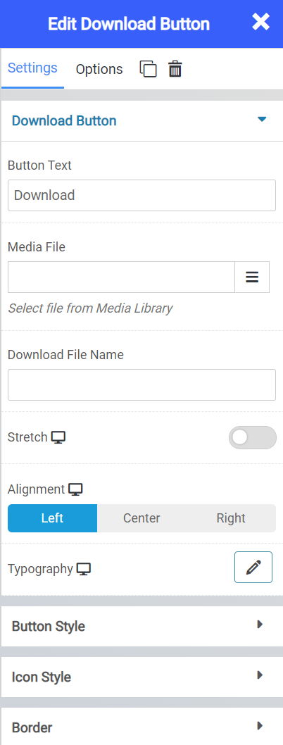
There are many settings for the Download widget, including:
- The option to set what text you want to display on the button.
- The choice of file you want to download.
- Whether you want the button to stretch the width of the page.
- The alignment of the button.
- And the typography used.
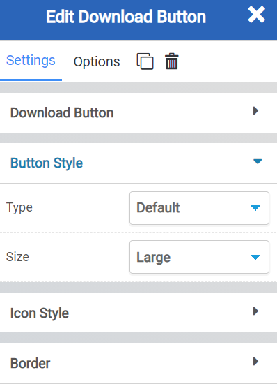
The button style settings allow you to:
- Set the button type.
- And the button size.
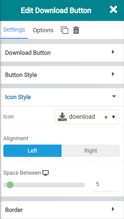
The Icon Style lettings let you set:
- The icon used on the button.
- The alignment of the text.
- The space between the buttons, if you choose to add extra ones.
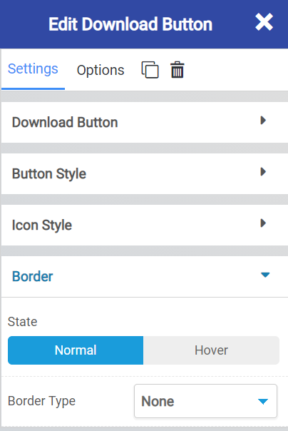
The Border settings let you:
- Set a state for the icon, whether it’s static or the border appears when a visitor hovers over the icon.
- And the border type, such as solid, dotted, dashed, etc.
Download Widget Options
There are a lot of options for this widget, including:
- Background Style
- This is a setting that is specific to the page layout. You can change the whether the background appears as a normal background or if you want the background to change when you hover over it.
- Background Type – This setting allows you to choose from the following settings:
- None – There will not be a background. This means the background of the page will be white, unless otherwise stated in Custom CSS.
- Color – You can specify a custom color for the background.
- Gradient – You can specify a custom gradient. A gradient is a smooth transition between 2 or more colors, which can give a cool effect.
- Image – You can upload a custom image to use as your background.
- Box Style – This setting allows you to adjust the padding and margin for the box that contains your blog post.
- Border Style – This setting allows you to control the following settings:
- Normal – You can have a normal border which is always there.
- Hover – You can have a border that only appears when the area it contains is hovered over.
- Border Type – You can choose from the following border types:
- Solid
- Double
- Dotted
- Dashed
- Grooved
- Border Radius – You can adjust the radius of the border around the box it contains to give it rounder or sharper corners.
- Font Style – This setting allows you to control the following settings:
- Font Family – This setting will allow you to change the font used on the entire page.
- Font Size – This setting allows you to change the size of the text used on the page.
- Font Style – This setting allows you to choose from the following font styles:
- Normal
- Italic
- Oblique
- What is Oblique? Oblique type is a form of a type which slants slightly to the right. It is similar to Italic, but it does not use different glyph (individual letter) shapes.
- Font Weight – This allows you to change the weight of the fonts used on the page.
- Font Variant – If the font you have selected has a variant, you can select it with this setting.
- Typical variants include, Small Caps and Big Caps.
- Animation – With this setting, you can configure number
- Attributes – With this setting, you can apply custom attributes using code.
- Custom CSS – if you want to change certain elements on the page using CSS, you can paste in the code to do that here.