The Website Builder includes over one hundred Widgets for you to use when customizing your website. As they are fully featured and able to do many things, they can be overwhelming to those who first start using them.
A Widget in the Website Builder is something you add to your page that does something, such as display text, an image, a spreadsheet table, or a video, for example.
The Widgets are broken down into groups, such as Grid, Text, Image, Button, Media, and others.
This Knowledgebase Article covers the Image Widgets in the Website Builder.
All About The Image Widgets in the Website Builder
There are 5 Image Widgets in the Website Builder. They are as follows:
- Image
- Image Slider
- Grid Gallery
- Image Hotspot
- Image Portfolio
Let’s explore what each of these widgets do.
Image Widget
The Image Widget allows you to insert an image onto your page. When inserted onto a page, this is what the widget looks like:
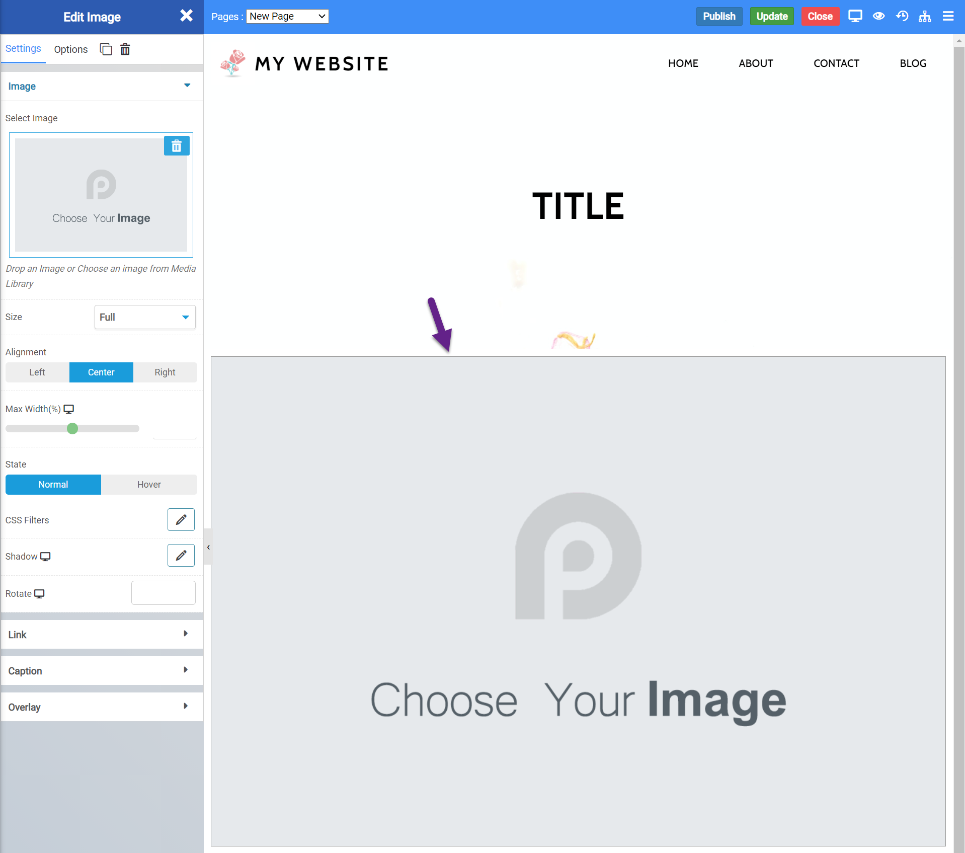
Image Widget Settings
There are numerous Image Widget Settings you should be aware of. Let’s look over them!
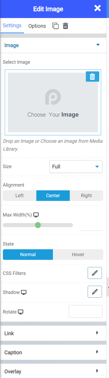
The Edit Image settings contain a few settings you should know about, including:
- The ability to choose which image you want to use.
- What size you want to use, such as Full, Fit to Scale, etc
- The alignment of the image
- The maximum width of the image
- It’s “State”, which means it will do nothing or you can set it to have an effect when it’s hovered over.
- You can also set custom CSS Filters, shadows, and a rotation degree to the image, as well.
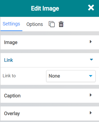
You can use the Link feature to Hyperlink the Image, so that when someone clicks on it, a new tab or window opens and they are taken to the destination you’ve set as the Link.
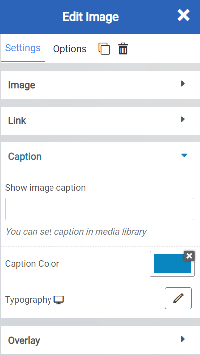
The Caption setting allows you to insert a caption below the image. You would actually set the Caption in the Media Library and it would show below the image.
You can also choose the caption text color and which font is used.
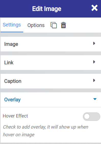
The Overlay setting allows you to set a Hover Effect overlay that shows when the user hovers over the image.
Image Widget Options
Beneath the “Edit Image” title, is the Edit Image Widget Settings. These allow you to control advanced functions of the Image Widget, including:
- Background Style
- This is a setting that is specific to the page layout. You can change the whether the background appears as a normal background or if you want the background to change when you hover over it.
- Background Type – This setting allows you to choose from the following settings:
- None – There will not be a background. This means the background of the page will be white, unless otherwise stated in Custom CSS.
- Color – You can specify a custom color for the background.
- Gradient – You can specify a custom gradient. A gradient is a smooth transition between 2 or more colors, which can give a cool effect.
- Image – You can upload a custom image to use as your background.
- Box Style – This setting allows you to adjust the padding and margin for the box that contains your blog post.
- Border Style – This setting allows you to control the following settings:
- Normal – You can have a normal border which is always there.
- Hover – You can have a border that only appears when the area it contains is hovered over.
- Border Type – You can choose from the following border types:
- Solid
- Double
- Dotted
- Dashed
- Grooved
- Border Radius – You can adjust the radius of the border around the box it contains to give it rounder or sharper corners.
- Font Style – This setting allows you to control the following settings:
- Font Family – This setting will allow you to change the font used on the entire page.
- Font Size – This setting allows you to change the size of the text used on the page.
- Font Style – This setting allows you to choose from the following font styles:
- Normal
- Italic
- Oblique
- What is Oblique? Oblique type is a form of a type which slants slightly to the right. It is similar to Italic, but it does not use different glyph (individual letter) shapes.
- Font Weight – This allows you to change the weight of the fonts used on the page.
- Font Variant – If the font you have selected has a variant, you can select it with this setting.
- Typical variants include, Small Caps and Big Caps.
- Animation – With this setting, you can configure number
- Attributes – With this setting, you can apply custom attributes using code.
- Custom CSS – if you want to change certain elements on the page using CSS, you can paste in the code to do that here.
Image Slider Widget
The Image Slider Widget allows you to insert a simple album made up or as many images as you’d like, from your Media Library.
When Inserted onto a page, the widget looks like this:
Image Slider Widget Settings
Let’s take a look at the settings that go along with this widget:
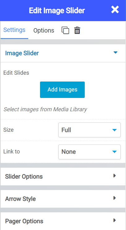
- Using the “Add Images” button beneath Edit Slides, you can select images from your Media Library to use in your Slide Widget.
- Using the Size Option, you can adjust the size of the slider widget.
- With “Link To”, you can set a hyperlink to the Image Slider, which can be useful for linking to a page that is dedicated to a larger album, for example.
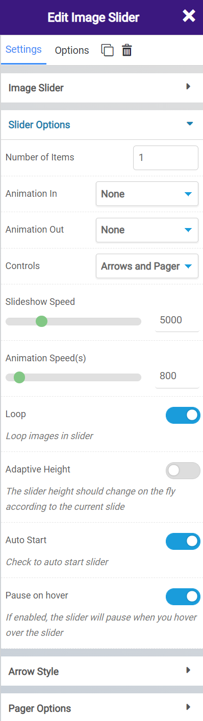
The Slider Options feature many settings, including:
- How many items you want in the slider.
- If you want any animations in or out, while the images load or disappear.
- Which controls you want to appear on the slider widget, if any.
- You can control the slideshow and animation speed.
- With the loop function, you can set the images in the slider widget to endlessly show, or stop after they have all been displayed.
- The Adaptive Height setting allows you to automatically have the size of the widget adjusted if an image in the set appears and is taller than the other images in the widget.
- Auto Start enables you to have the slider start immediately as the page loads. Turning this off will require the visitor of the site to manually engage with the slider.
- The Pause on Hover option will freeze the slideshow when a visitor hovers over an image.
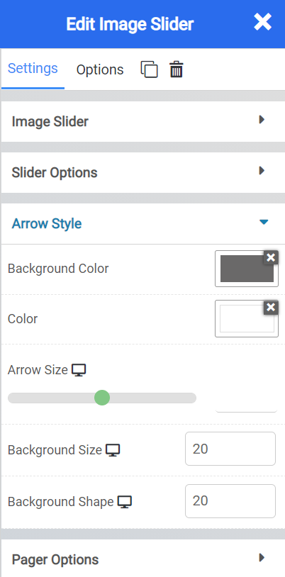
The Arrow Styles allow you to control the way the controls look, including:
- Setting the background color and color of the arrow.
- The size of the arrow
- And the size and shape (in pixels) of the background.
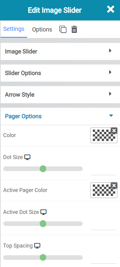
The Pager options allow you to control the little pagination feature that will display if you’ve added enough images to the image slider widget for there to be multiple pages. With these options, you can control or set the following:
- The Color of the page selector.
- The size of the page dot indicators
- The active page color
- The active page dot size
- And the spacing between the bottom of the slider widget and the top of the page indicator.
Image Slider Widget Options
The Image Slider Widget has a lot of settings, including:
- Background Style
- This is a setting that is specific to the page layout. You can change the whether the background appears as a normal background or if you want the background to change when you hover over it.
- Background Type – This setting allows you to choose from the following settings:
- None – There will not be a background. This means the background of the page will be white, unless otherwise stated in Custom CSS.
- Color – You can specify a custom color for the background.
- Gradient – You can specify a custom gradient. A gradient is a smooth transition between 2 or more colors, which can give a cool effect.
- Image – You can upload a custom image to use as your background.
- Box Style – This setting allows you to adjust the padding and margin for the box that contains your blog post.
- Border Style – This setting allows you to control the following settings:
- Normal – You can have a normal border which is always there.
- Hover – You can have a border that only appears when the area it contains is hovered over.
- Border Type – You can choose from the following border types:
- Solid
- Double
- Dotted
- Dashed
- Grooved
- Border Radius – You can adjust the radius of the border around the box it contains to give it rounder or sharper corners.
- Font Style – This setting allows you to control the following settings:
- Font Family – This setting will allow you to change the font used on the entire page.
- Font Size – This setting allows you to change the size of the text used on the page.
- Font Style – This setting allows you to choose from the following font styles:
- Normal
- Italic
- Oblique
- What is Oblique? Oblique type is a form of a type which slants slightly to the right. It is similar to Italic, but it does not use different glyph (individual letter) shapes.
- Font Weight – This allows you to change the weight of the fonts used on the page.
- Font Variant – If the font you have selected has a variant, you can select it with this setting.
- Typical variants include, Small Caps and Big Caps.
- Animation – With this setting, you can configure number
- Attributes – With this setting, you can apply custom attributes using code.
- Custom CSS – if you want to change certain elements on the page using CSS, you can paste in the code to do that here.
Grid Gallery Widget
The Grid Gallery Widget allows you to add multiple photos, which will show up as a grid style gallery, and when the visitor clicks on one of the images, that image will display in larger size.
When inserted onto a page, the widget looks like this:
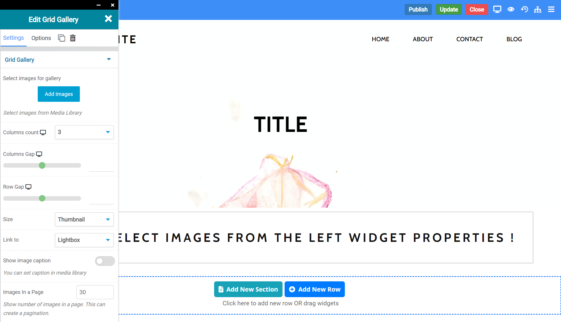
Grid Gallery Widget Settings
The Grid Gallery Widget has a few settings you should be aware of, including:
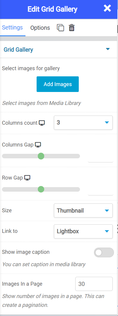
- With “Add Images”, you can select images to show in the Grid Gallery Widget from your Media Library.
- Using the Columns Count, you can adjust how many grid columns there are.
- With Columns Gap, you can adjust the spacing (gap) between the columns.
- The same goes for row gap, but you’d be adjusting the gap between the rows.
- The Size feature allows you to adjust the size of the images in the grid.
- Link To allows you to choose how you want to link the images, and where you want them to go.
- With Show Image Caption, you can choose to show the caption on the image, if you have set one from the Media Library.
- The Images in a Page option lets you define how many images you want to show on the grid before the visitor has to go to page 2 to see more images.
Grid Gallery Widget Options
There are a lot of options for this widget you should be aware of:
- Background Style
- This is a setting that is specific to the page layout. You can change the whether the background appears as a normal background or if you want the background to change when you hover over it.
- Background Type – This setting allows you to choose from the following settings:
- None – There will not be a background. This means the background of the page will be white, unless otherwise stated in Custom CSS.
- Color – You can specify a custom color for the background.
- Gradient – You can specify a custom gradient. A gradient is a smooth transition between 2 or more colors, which can give a cool effect.
- Image – You can upload a custom image to use as your background.
- Box Style – This setting allows you to adjust the padding and margin for the box that contains your blog post.
- Border Style – This setting allows you to control the following settings:
- Normal – You can have a normal border which is always there.
- Hover – You can have a border that only appears when the area it contains is hovered over.
- Border Type – You can choose from the following border types:
- Solid
- Double
- Dotted
- Dashed
- Grooved
- Border Radius – You can adjust the radius of the border around the box it contains to give it rounder or sharper corners.
- Font Style – This setting allows you to control the following settings:
- Font Family – This setting will allow you to change the font used on the entire page.
- Font Size – This setting allows you to change the size of the text used on the page.
- Font Style – This setting allows you to choose from the following font styles:
- Normal
- Italic
- Oblique
- What is Oblique? Oblique type is a form of a type which slants slightly to the right. It is similar to Italic, but it does not use different glyph (individual letter) shapes.
- Font Weight – This allows you to change the weight of the fonts used on the page.
- Font Variant – If the font you have selected has a variant, you can select it with this setting.
- Typical variants include, Small Caps and Big Caps.
- Animation – With this setting, you can configure number
- Attributes – With this setting, you can apply custom attributes using code.
- Custom CSS – if you want to change certain elements on the page using CSS, you can paste in the code to do that here.
Image Hotspot Widget
The Image Hotspot Widget allows you to add an image that has an icon displayed over the image, which when hovered over by a site visitor shows information.
When inserted into a page, it looks like this:
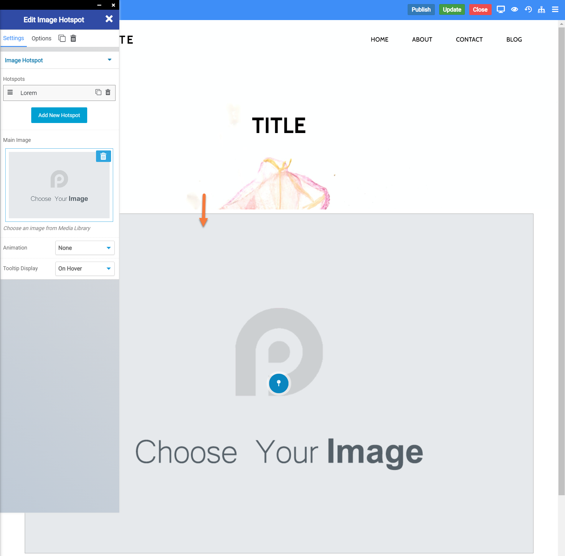
Image Hotspot Widget Settings
There are a few Image Hotspot Widget settings you should be aware of. Let’s take a look at them:
- The Hotspots feature allows you to add/remove hotspots to the Image, which depending on what you are depicting in the image, can be very useful to conveying more information.
- The “Main Image” feature allows you to choose an image from your Media Library to use as the main image in this widget.
- Animation allows you to choose an animation for the image used in the widget.
- Tooltip Display lets you display a note or caption about the widget/image used in the widget, and whether you want it to show all the time or when the website visitor hovers over the widget area.
Image Hotspot Widget Options
There are many options available for the Image Hotspot Widget, including:
- Background Style
- This is a setting that is specific to the page layout. You can change the whether the background appears as a normal background or if you want the background to change when you hover over it.
- Background Type – This setting allows you to choose from the following settings:
- None – There will not be a background. This means the background of the page will be white, unless otherwise stated in Custom CSS.
- Color – You can specify a custom color for the background.
- Gradient – You can specify a custom gradient. A gradient is a smooth transition between 2 or more colors, which can give a cool effect.
- Image – You can upload a custom image to use as your background.
- Box Style – This setting allows you to adjust the padding and margin for the box that contains your blog post.
- Border Style – This setting allows you to control the following settings:
- Normal – You can have a normal border which is always there.
- Hover – You can have a border that only appears when the area it contains is hovered over.
- Border Type – You can choose from the following border types:
- Solid
- Double
- Dotted
- Dashed
- Grooved
- Border Radius – You can adjust the radius of the border around the box it contains to give it rounder or sharper corners.
- Font Style – This setting allows you to control the following settings:
- Font Family – This setting will allow you to change the font used on the entire page.
- Font Size – This setting allows you to change the size of the text used on the page.
- Font Style – This setting allows you to choose from the following font styles:
- Normal
- Italic
- Oblique
- What is Oblique? Oblique type is a form of a type which slants slightly to the right. It is similar to Italic, but it does not use different glyph (individual letter) shapes.
- Font Weight – This allows you to change the weight of the fonts used on the page.
- Font Variant – If the font you have selected has a variant, you can select it with this setting.
- Typical variants include, Small Caps and Big Caps.
- Animation – With this setting, you can configure number
- Attributes – With this setting, you can apply custom attributes using code.
- Custom CSS – if you want to change certain elements on the page using CSS, you can paste in the code to do that here.
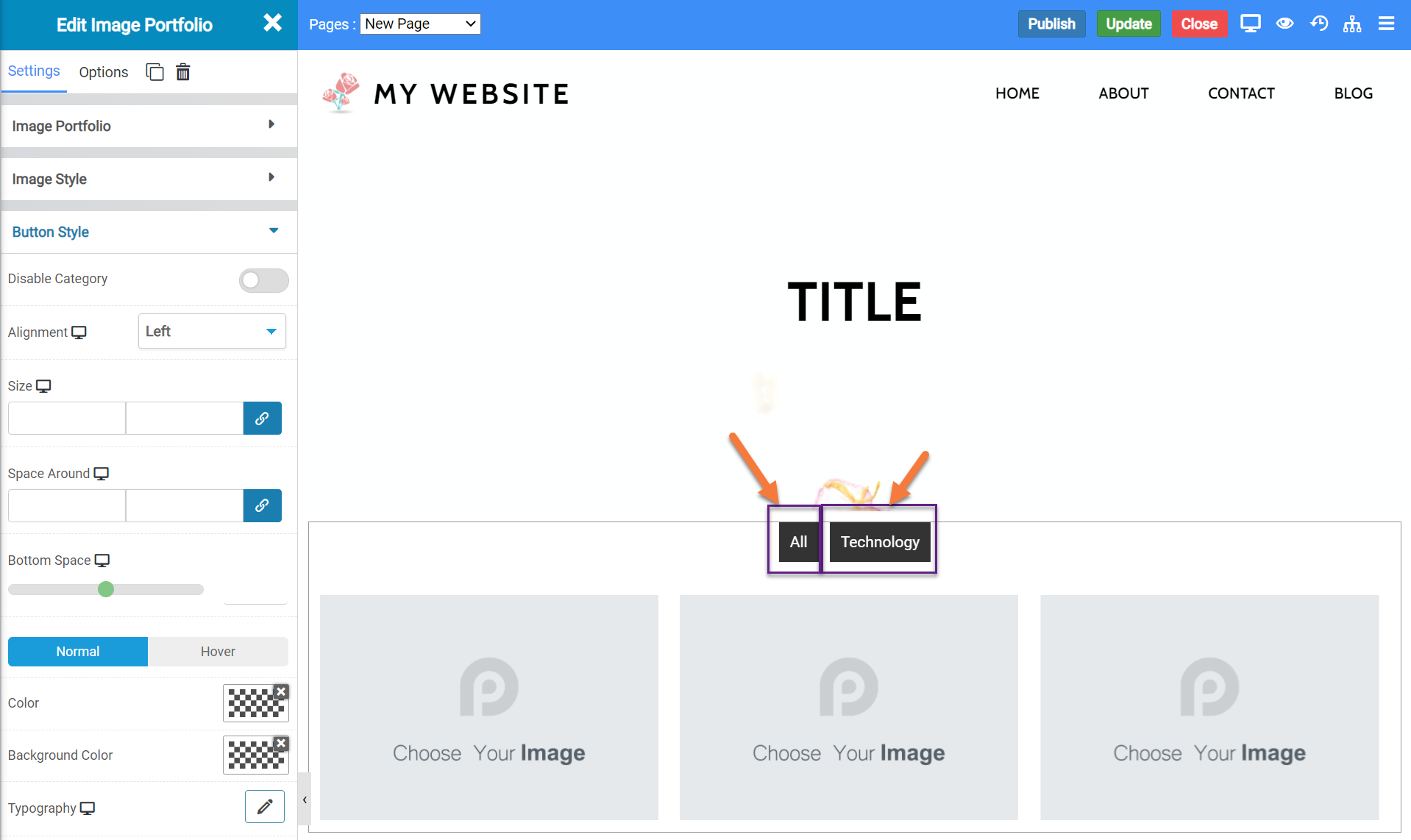
Image Portfolio Widget
The Image Portfolio Widget is an advanced image gallery widget which allows you to show multiple photos with multiple galleries in a single widget. Let’s say you’re a photographer and you take photos of landscapes, families, and space.
You could insert an image portfolio widget on your site that showcases your top photos from each of these categories and at the top of the widget, there will be a tab which allows visitors to your site to switch between the different categories on the widget.
When inserted onto a page, the widget looks like this:
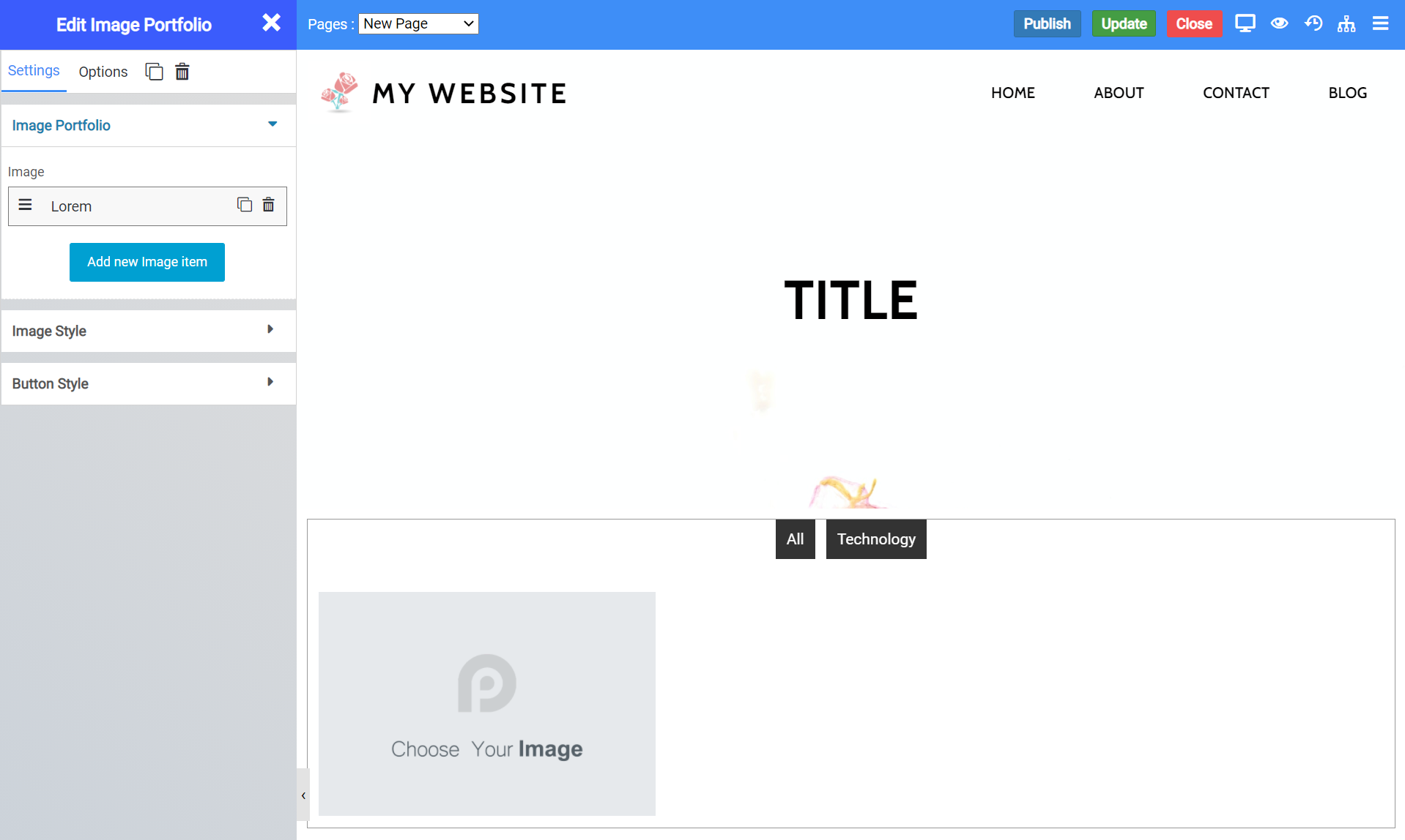
Image Portfolio Widget Settings
There are numerous settings for this widget you should be aware of, let’s take a look at them:
- Beneath Image portfolio, you have the option to add new images. By clicking Add New Image Item, you can add new items to the portfolio grid.
- This is also where you would choose the images you want to show from your Media Library.
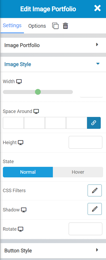
- Beneath Image Style, you can edit the width of each image in the grid, plus the space around them, and the height of the images.
- You can also set a state for them to show when they are static, or when someone hovers over them.
- Additionally, you can set custom CSS FIlters, Shadows, and a Rotation degree.
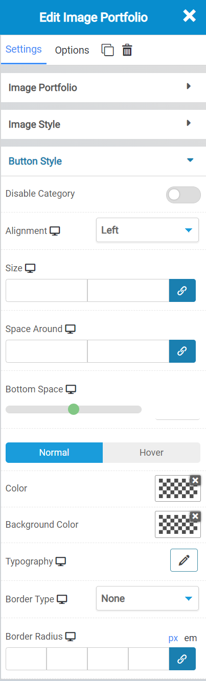
The Button Style settings allow you to adjust the way the Category button in the slider looks.
This is the category button:
With the Button Style settings, you can do the following:
- Disable the category button, if you don’t want it to show.
- Select the alignment of the buttons.
- Select the size and space around the buttons, plus the bottom spacing.
- You can also set a state for them to show when they are static, or when someone hovers over them.
- You can also choose which color and background color for the buttons.
- Set the typography settings, what type of border, and a radius for the border, if you want.
Image Portfolio Widget Options:
There are a lot of options for the Image Portfolio Widget you should be aware of:
- Background Style
- This is a setting that is specific to the page layout. You can change the whether the background appears as a normal background or if you want the background to change when you hover over it.
- Background Type – This setting allows you to choose from the following settings:
- None – There will not be a background. This means the background of the page will be white, unless otherwise stated in Custom CSS.
- Color – You can specify a custom color for the background.
- Gradient – You can specify a custom gradient. A gradient is a smooth transition between 2 or more colors, which can give a cool effect.
- Image – You can upload a custom image to use as your background.
- Box Style – This setting allows you to adjust the padding and margin for the box that contains your blog post.
- Border Style – This setting allows you to control the following settings:
- Normal – You can have a normal border which is always there.
- Hover – You can have a border that only appears when the area it contains is hovered over.
- Border Type – You can choose from the following border types:
- Solid
- Double
- Dotted
- Dashed
- Grooved
- Border Radius – You can adjust the radius of the border around the box it contains to give it rounder or sharper corners.
- Font Style – This setting allows you to control the following settings:
- Font Family – This setting will allow you to change the font used on the entire page.
- Font Size – This setting allows you to change the size of the text used on the page.
- Font Style – This setting allows you to choose from the following font styles:
- Normal
- Italic
- Oblique
- What is Oblique? Oblique type is a form of a type which slants slightly to the right. It is similar to Italic, but it does not use different glyph (individual letter) shapes.
- Font Weight – This allows you to change the weight of the fonts used on the page.
- Font Variant – If the font you have selected has a variant, you can select it with this setting.
- Typical variants include, Small Caps and Big Caps.
- Animation – With this setting, you can configure number
- Attributes – With this setting, you can apply custom attributes using code.
- Custom CSS – if you want to change certain elements on the page using CSS, you can paste in the code to do that here.