The Website Builder includes over one hundred Widgets for you to use when customizing your website. As they are fully featured and able to do many things, they can be overwhelming to those who first start using them.
A Widget in the Website Builder is something you add to your page that does something, such as display text, an image, a spreadsheet table, or a video, for example.
The Widgets are broken down into groups, such as Grid, Text, Image, Button, Media, and others.
This Knowledgebase Article covers the Text Widgets in the Website Builder.
All About The Text Widgets in the Website Builder
There are eight Text Widgets. They are as follows:
- Title
- Rich Text
- Quote
- List
- Icon
- Badge
- Tooltip
- Animated Heading
Let’s explore what each of these widgets do.
Title Widget
The Title Widget allows you to add Headline Text to a section of your web page. This is used to call attention to the beginning of a story or section of a story.
When added to a page, it looks like this:

Title Widget Settings
You have a few options on the left side when it comes to editing the Heading Text:
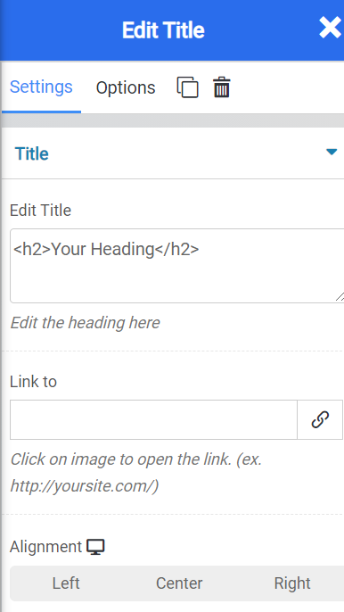
The editor at the top allows you to edit the text here, if you wish, instead of on the page preview to the right side (not pictured).
You can also make the Title Text a link, which is super handy if the title is to a Blog post and you like to link the full URL of the blog post to the Title of the post so people can open the post in it’s own page.
With the alignment feature, you can adjust the alignment of the Title text to best suit your design needs.
Title Widget Options
Beneath Edit Title, the “Options” tab allows you to control the following settings:
- Background Style
- This is a setting that is specific to the page layout. You can change the whether the background appears as a normal background or if you want the background to change when you hover over it.
- Background Type – This setting allows you to choose from the following settings:
- None – There will not be a background. This means the background of the page will be white, unless otherwise stated in Custom CSS.
- Color – You can specify a custom color for the background.
- Gradient – You can specify a custom gradient. A gradient is a smooth transition between 2 or more colors, which can give a cool effect.
- Image – You can upload a custom image to use as your background.
- Box Style – This setting allows you to adjust the padding and margin for the box that contains your blog post.
- Border Style – This setting allows you to control the following settings:
- Normal – You can have a normal border which is always there.
- Hover – You can have a border that only appears when the area it contains is hovered over.
- Border Type – You can choose from the following border types:
- Solid
- Double
- Dotted
- Dashed
- Grooved
- Border Radius – You can adjust the radius of the border around the box it contains to give it rounder or sharper corners.
- Font Style – This setting allows you to control the following settings:
- Font Family – This setting will allow you to change the font used on the entire page.
- Font Size – This setting allows you to change the size of the text used on the page.
- Font Style – This setting allows you to choose from the following font styles:
- Normal
- Italic
- Oblique
- What is Oblique? Oblique type is a form of a type which slants slightly to the right. It is similar to Italic, but it does not use different glyph (individual letter) shapes.
- Font Weight – This allows you to change the weight of the fonts used on the page.
- Font Variant – If the font you have selected has a variant, you can select it with this setting.
- Typical variants include, Small Caps and Big Caps.
- Animation – With this setting, you can configure number
- Attributes – With this setting, you can apply custom attributes using code.
- Custom CSS – if you want to change certain elements on the page using CSS, you can paste in the code to do that here.
Rich Text Widget
The Rich Text Widget allows you to enter text that is formatted any way you like. The term “rich” comes from the ability to use features like Bold, Italic, and Underline, to make the text “pop on the page”.
When inserted into a page, the Rich Text Widget looks like this:

You have many options when it comes to editing the text. Below is the Rich Text editor:

Rich Text Widget Settings
As you can see from the options above, the Website Builder is quite capable of giving you the option to personalize the text on your website.
Rich Text Widget Options
Beneath Edit Rich Text, the “Options” tab allows you to control the following settings:
- Background Style
- This is a setting that is specific to the page layout. You can change the whether the background appears as a normal background or if you want the background to change when you hover over it.
- Background Type – This setting allows you to choose from the following settings:
- None – There will not be a background. This means the background of the page will be white, unless otherwise stated in Custom CSS.
- Color – You can specify a custom color for the background.
- Gradient – You can specify a custom gradient. A gradient is a smooth transition between 2 or more colors, which can give a cool effect.
- Image – You can upload a custom image to use as your background.
- Box Style – This setting allows you to adjust the padding and margin for the box that contains your blog post.
- Border Style – This setting allows you to control the following settings:
- Normal – You can have a normal border which is always there.
- Hover – You can have a border that only appears when the area it contains is hovered over.
- Border Type – You can choose from the following border types:
- Solid
- Double
- Dotted
- Dashed
- Grooved
- Border Radius – You can adjust the radius of the border around the box it contains to give it rounder or sharper corners.
- Font Style – This setting allows you to control the following settings:
- Font Family – This setting will allow you to change the font used on the entire page.
- Font Size – This setting allows you to change the size of the text used on the page.
- Font Style – This setting allows you to choose from the following font styles:
- Normal
- Italic
- Oblique
- What is Oblique? Oblique type is a form of a type which slants slightly to the right. It is similar to Italic, but it does not use different glyph (individual letter) shapes.
- Font Weight – This allows you to change the weight of the fonts used on the page.
- Font Variant – If the font you have selected has a variant, you can select it with this setting.
- Typical variants include, Small Caps and Big Caps.
- Animation – With this setting, you can configure number
- Attributes – With this setting, you can apply custom attributes using code.
- Custom CSS – if you want to change certain elements on the page using CSS, you can paste in the code to do that here.
Quote Widget
The Quote Widget is really handy for adding testimonial text to your website. If you are selling a product or service, testimonials can be an important part of convincing your website.
When added to a Website, the Quote Widget looks like this:

Quote Widget Settings
There are a few Quote Widget Settings to call out:

- At the top of the Editor is the Quote section where you can enter the text of your quote. You can do this on the page as well, if you prefer.
- You can adjust other settings such as the color of the text, the background color, and the space between the other widget on the page, plus the font that is used.

- With the Quote Style settings, you can change the quotation type from:
- Default
- Quotation
- Double Quotation
- Adjust the position of your Quote Widget by using the Positioning tool.
- With Size, you can make the Quote smaller or larger.
- Change the color of the Quotes if you wish using the color picker.
- Align your quote from left, center, or right using the Alignment feature.

- Make sure your quote citation is present using the Cite Settings where you can set a Name for the Author of the quote.
- If you wish, you can also apply a hyperlink to the quote, if you are linking the author of the quote to their blog, for example.
- You can also adjust additional settings, such as the alignment and typography settings of the citation.

- The Left Border settings let you control the tiny area that is to the left of the Quote and Citation. The left border is a design element.
- With the Width setting, you can adjust how wide the border is.
- You can adjust the color of the border fill, and set it to a color that goes with your theme.
- You can adjust how much space is in between the border and the citation text using the Left spacing.
- With the Top Bottom spacing, you can adjust the space between the top bottom.
Quote Widget Options
Beneath Edit Quote, the “Options” tab allows you to control the following settings:
- Background Style
- This is a setting that is specific to the page layout. You can change the whether the background appears as a normal background or if you want the background to change when you hover over it.
- Background Type – This setting allows you to choose from the following settings:
- None – There will not be a background. This means the background of the page will be white, unless otherwise stated in Custom CSS.
- Color – You can specify a custom color for the background.
- Gradient – You can specify a custom gradient. A gradient is a smooth transition between 2 or more colors, which can give a cool effect.
- Image – You can upload a custom image to use as your background.
- Box Style – This setting allows you to adjust the padding and margin for the box that contains your blog post.
- Border Style – This setting allows you to control the following settings:
- Normal – You can have a normal border which is always there.
- Hover – You can have a border that only appears when the area it contains is hovered over.
- Border Type – You can choose from the following border types:
- Solid
- Double
- Dotted
- Dashed
- Grooved
- Border Radius – You can adjust the radius of the border around the box it contains to give it rounder or sharper corners.
- Font Style – This setting allows you to control the following settings:
- Font Family – This setting will allow you to change the font used on the entire page.
- Font Size – This setting allows you to change the size of the text used on the page.
- Font Style – This setting allows you to choose from the following font styles:
- Normal
- Italic
- Oblique
- What is Oblique? Oblique type is a form of a type which slants slightly to the right. It is similar to Italic, but it does not use different glyph (individual letter) shapes.
- Font Weight – This allows you to change the weight of the fonts used on the page.
- Font Variant – If the font you have selected has a variant, you can select it with this setting.
- Typical variants include, Small Caps and Big Caps.
- Animation – With this setting, you can configure number
- Attributes – With this setting, you can apply custom attributes using code.
- Custom CSS – if you want to change certain elements on the page using CSS, you can paste in the code to do that here.
List Widget
The List Widget is useful when you need to add items to your site in a listed format. You can choose from hundreds of icon options to lead your list as bullet styles, as well.
When inserted onto a page, the List Widget looks like this:

List Widget Settings
Let’s review the List Widget Settings!

- At the very top you have the List Item Editor. This is where you would add and remove items from your list.
- Using the hamburger menu that is on the left of the List Item, you can rearrange them as you wish.
- The clone icon to the right of the List Item allows you to duplicate that item.
- Beneath it, you can click the Add Item to add an item to the list.
- There are a number of list styles you can choose from:

In addition to different styles (above) you can adjust the space between the different items on the list and the icon on the left.

Let’s look at the Text Styles:
- State allows you to set whether the styles appear when they are Normal or Hovered over.
- You can also change the color of the list items text, or the background color of the list container.
- With the typography setting, you can change the fonts used.
- Using the Intent feature, you can change how far inward the list items appear from the edge margin of the page.

Taking a look at the Icon Style settings:
- With the State feature, you can change the color of the icons as they are (static) or only when they’re hovered over.
- The Color feature allows you to adjust the color of the icons.
- Size allows you to increase or decrease the overall size of the icons.

Let’s peek at the Divider settings:
- The divider is the line between different items on the list.
- You can change the type from:
- None
- Solid
- Double
- Dotted
- Dashed
- Groove
- You can adjust the color of the divider.
- And you can set the width of the divider in pixels.
List Widget Options
Beneath Edit List, the “Options” tab allows you to control the following settings:
- Background Style
- This is a setting that is specific to the page layout. You can change the whether the background appears as a normal background or if you want the background to change when you hover over it.
- Background Type – This setting allows you to choose from the following settings:
- None – There will not be a background. This means the background of the page will be white, unless otherwise stated in Custom CSS.
- Color – You can specify a custom color for the background.
- Gradient – You can specify a custom gradient. A gradient is a smooth transition between 2 or more colors, which can give a cool effect.
- Image – You can upload a custom image to use as your background.
- Box Style – This setting allows you to adjust the padding and margin for the box that contains your blog post.
- Border Style – This setting allows you to control the following settings:
- Normal – You can have a normal border which is always there.
- Hover – You can have a border that only appears when the area it contains is hovered over.
- Border Type – You can choose from the following border types:
- Solid
- Double
- Dotted
- Dashed
- Grooved
- Border Radius – You can adjust the radius of the border around the box it contains to give it rounder or sharper corners.
- Font Style – This setting allows you to control the following settings:
- Font Family – This setting will allow you to change the font used on the entire page.
- Font Size – This setting allows you to change the size of the text used on the page.
- Font Style – This setting allows you to choose from the following font styles:
- Normal
- Italic
- Oblique
- What is Oblique? Oblique type is a form of a type which slants slightly to the right. It is similar to Italic, but it does not use different glyph (individual letter) shapes.
- Font Weight – This allows you to change the weight of the fonts used on the page.
- Font Variant – If the font you have selected has a variant, you can select it with this setting.
- Typical variants include, Small Caps and Big Caps.
- Animation – With this setting, you can configure number
- Attributes – With this setting, you can apply custom attributes using code.
- Custom CSS – if you want to change certain elements on the page using CSS, you can paste in the code to do that here.
Icon Widget
The Website Builder incorporates the icon set from Font Awesome which gives you access to hundreds of different icons. Using the Icon Widget allows you to place one of these icons on your website.
When inserted into a page, the icon widget looks like this:

Icon Widget Settings
There are several settings for the Icon Widget you should be aware of:

- The Icon selector allows you to choose from hundreds of icons.
- If you are inserting multiple icons, you can control the spacing between them with the Background Spacing options.
- With Link, you can hyperlink the Icon itself to another URL on the internet.
- Using the Alignment feature, you can change the alignment of the icon.

- In the Style and Hover Effects, you can set a Hover or Normal effect for the Icon.
- You can also change the color of the icon fill here.
- If you want a shape to appear in the background, you can choose one from the list.
- You can also choose the size of the icon using the drop down next to Size.
- You can enter a rotation, if you wish, for the icon, as well.

- For Border Effects, you can choose a border to appear all the time or when the icon is hovered over.
- For Border type, you can choose from border styles, such as solid line, dotted line, dashed lines, etc.
Icon Widget Options
- Background Style
- This is a setting that is specific to the page layout. You can change the whether the background appears as a normal background or if you want the background to change when you hover over it.
- Background Type – This setting allows you to choose from the following settings:
- None – There will not be a background. This means the background of the page will be white, unless otherwise stated in Custom CSS.
- Color – You can specify a custom color for the background.
- Gradient – You can specify a custom gradient. A gradient is a smooth transition between 2 or more colors, which can give a cool effect.
- Image – You can upload a custom image to use as your background.
- Box Style – This setting allows you to adjust the padding and margin for the box that contains your blog post.
- Border Style – This setting allows you to control the following settings:
- Normal – You can have a normal border which is always there.
- Hover – You can have a border that only appears when the area it contains is hovered over.
- Border Type – You can choose from the following border types:
- Solid
- Double
- Dotted
- Dashed
- Grooved
- Border Radius – You can adjust the radius of the border around the box it contains to give it rounder or sharper corners.
- Font Style – This setting allows you to control the following settings:
- Font Family – This setting will allow you to change the font used on the entire page.
- Font Size – This setting allows you to change the size of the text used on the page.
- Font Style – This setting allows you to choose from the following font styles:
- Normal
- Italic
- Oblique
- What is Oblique? Oblique type is a form of a type which slants slightly to the right. It is similar to Italic, but it does not use different glyph (individual letter) shapes.
- Font Weight – This allows you to change the weight of the fonts used on the page.
- Font Variant – If the font you have selected has a variant, you can select it with this setting.
- Typical variants include, Small Caps and Big Caps.
- Animation – With this setting, you can configure number
- Attributes – With this setting, you can apply custom attributes using code.
- Custom CSS – if you want to change certain elements on the page using CSS, you can paste in the code to do that here.
Badge Widget
The Badge widget allows you to add a colored label adjacent to title text. This can be used for sorting content, or adding warning or notation tags (badges) to certain texts.
When inserted into a page, the widget looks like this:

Badge Widget Settings
There are several settings for the badge widget you should be aware of:

- The Client Areael option allows you to change the text that is displayed inside the badge. The default is Badge, but you can make it say anything.
- URL allows you to hyperlink the badge to another site on the Internet.
- The Type option allows you to select from a drop down preset looks for the Badge. You can choose from:
- Primary
- Secondary
- Success
- Warning
- Danger
- Info
- Light
- Dark
- Custom
- Badge Style allows you to change the shape of the badge from Normal (or rectangular) or Pill shaped.
- You can also change the vertical alignment of the Badge to Top or Bottom for appearance purposes.

The Text options allow you to change the text that is adjacent to the Badge and the way it looks. You can choose from these settings:
- Where it says “your custom text” you can change the text inside the box adjacent to the badge.
- Using State, you can change the way the text appears when it is hovered over or static.
- You can change the color of the text using the color picker.
- Using typography, you can change the font that is used in the text box.

The Badge Style settings allow you to change a few of the appearance settings for the Badge Widget:
- Using the Space Between slider, you can adjust the space between the Badge and the text to the left of the Badge.
- Using Top Bottom spacing, you can adjust the spacing between the top and bottom lines containing the Badge.
- Using Left Right spacing, you can adjust the spacing between the left and the right of the cell containing the Badge.
- With Typography, you can adjust the Font that is used in the Badge.

The Button Badge allows you to turn the text (to the left of the badge) + the badge itself into a web button, i.e. the kind that looks like it’s from an old fashioned website.
When enabled, the button looks like this:

Tool Tip Widget
The Tool Tip Widget allows you to insert text, which when hovered over by the user, will show a tool tip with additional information.
When inserted into a page, this is what the widget looks like:

Tool Tip Widget Settings
The Tool Tip Widget is a feature-rich widget and has many functions you should be aware of. Let’s take a look:

- The “Text” field is where you edit the text that appears all the time, i.e. not the text that appears when the user hovers over the text.
- The content area is where you will find a fully functioning rich text editor. You can use these options to insert media, change font and paragraph settings, and more.
- At the very bottom is the text editor where you will enter the text that shows when the tooltip is activated (when the user hovers over the text).

The Icon option allows you to insert an icon next to the tool tip widget text. You can choose from hundreds of icons.
When enabled, the icon looks like this:

You can also choose the color of the Icon, as well as it’s spacing between it and the text.
Additionally you can choose the alignment of the Icon to be either on the left side of the text, or the right, as depicted above.

The Text Style options allow you to change numerous settings related to the text that shows outside of the tool tip widget.
You can change the following settings:
- The alignment of the text.
- The color of the text.
- Which font is used.
- And if the text should have a shadow beneath it.

The Tooltip Style settings allow you to change settings related to the text that is inside the tooltip. I.e. the text which appears when the user hovers over the widget.
You can change the following settings:
- The position of the tool tip itself, and where it pops out from.
- The widget width.
- The inner space in the widget, making it bigger or smaller.
- The background color.
- The color of the widget itself.
- Which font is used.
- And if the widget should have a shadow around the box.
Animated Heading Widget
The Animated Heading Widget allows you to add a heading which features an animation.
When inserted into a page, the default animation looks like this:

Please note, there are various effects to choose from.
Animated Heading Settings

The Animated Heading settings allow you to control various settings including;
- The type of effect you want to use.
- Which effect you want to use.
- And the alignment of the heading widget itself.

The Title Style settings allow you to adjust settings related to the text that is displayed as part of the heading, including:
- The text of the heading.
- Which font is used.
- Whether you want to use a solid color or a gradient as the font color.
- And the color of the font.

The Miscellaneous setting allows you to adjust settings related to the effect. In the image above, you can see I have the ability to choose the colors of the blobs that are animated onto the heading. This is because I have Blobs as the chosen effect.
Your settings here will vary depending on the effect you choose.
Animated Heading Widget Options
The Animated Heading Widget has a lot of different settings, including:
- Background Style
- This is a setting that is specific to the page layout. You can change the whether the background appears as a normal background or if you want the background to change when you hover over it.
- Background Type – This setting allows you to choose from the following settings:
- None – There will not be a background. This means the background of the page will be white, unless otherwise stated in Custom CSS.
- Color – You can specify a custom color for the background.
- Gradient – You can specify a custom gradient. A gradient is a smooth transition between 2 or more colors, which can give a cool effect.
- Image – You can upload a custom image to use as your background.
- Box Style – This setting allows you to adjust the padding and margin for the box that contains your blog post.
- Border Style – This setting allows you to control the following settings:
- Normal – You can have a normal border which is always there.
- Hover – You can have a border that only appears when the area it contains is hovered over.
- Border Type – You can choose from the following border types:
- Solid
- Double
- Dotted
- Dashed
- Grooved
- Border Radius – You can adjust the radius of the border around the box it contains to give it rounder or sharper corners.
- Font Style – This setting allows you to control the following settings:
- Font Family – This setting will allow you to change the font used on the entire page.
- Font Size – This setting allows you to change the size of the text used on the page.
- Font Style – This setting allows you to choose from the following font styles:
- Normal
- Italic
- Oblique
- What is Oblique? Oblique type is a form of a type which slants slightly to the right. It is similar to Italic, but it does not use different glyph (individual letter) shapes.
- Font Weight – This allows you to change the weight of the fonts used on the page.
- Font Variant – If the font you have selected has a variant, you can select it with this setting.
- Typical variants include, Small Caps and Big Caps.
- Animation – With this setting, you can configure number
- Attributes – With this setting, you can apply custom attributes using code.
- Custom CSS – if you want to change certain elements on the page using CSS, you can paste in the code to do that here.